A histogram is a summary graph showing a count of data points that fall in various ranges. Histograms are used in statistics and other forms of mathematics. In this video, learn how to create your own histogram using data analysis on the computer. This tutorial will show you how to create a frequency distribution, a cumulative frequency distribution, a histogram chart and an ogive chart with the data analysis add-in.

There are times when you need to make a super-quick pie chart (such as to insert in a blog post or quick printout) but find that doing it in Excel or OpenOffice takes a bit more effort than you’d like. Is there a faster way for quick’n'dirty pie charts? Yes. You can use Create a Graph. Stupidly easy to use and very fast, just the way people like it. Learn how with this video tutorial.

Here is a tutorial on how you can design makeup on a paper face chart.
Using Excel 2007 to create a Gantt chart--a popular project management tool.
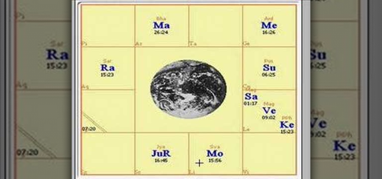
This Video will explain how to read the Vedic astrology chart.

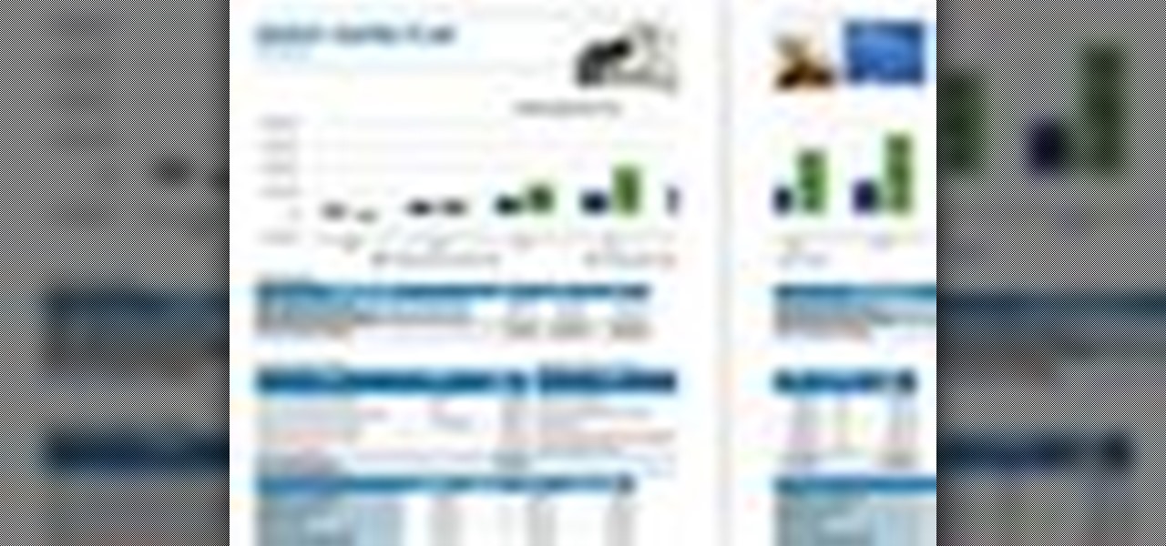
Learn some useful tips to make your Microft Excel spreadsheets soar and how to use Excel to create forms and charts.

Learn how to better organize and convey your data to colleagues- create your own professional-looking charts in Microsoft Publisher.
Check out this informative video tutorial from Apple on how to create and edit charts in Pages '09. iWork '09, the office productivity suite from Apple, is the easiest way to create documents, spreadsheets, and presentations. Writing and page layouts are easy in Pages. Numbers gives you simple ways to make sense of your data. You'll captivate your audience with new and sophisticated features in Keynote.
Check out this informative video tutorial from Apple on how to get started using Numbers '09. iWork '09, the office productivity suite from Apple, is the easiest way to create documents, spreadsheets, and presentations. Writing and page layouts are easy in Pages. Numbers gives you simple ways to make sense of your data. You'll captivate your audience with new and sophisticated features in Keynote.
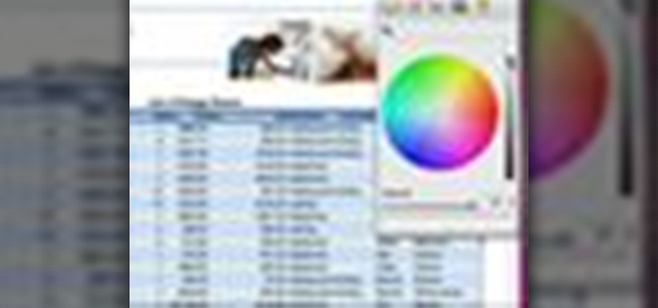
Check out this informative video tutorial from Apple on how to use tables, color, images and fonts in Numbers '09.
Check out this informative video tutorial from Apple on how to format data values with the format bar in Numbers '09.
Check out this informative video tutorial from Apple on how to create formulas with Quick Formula in Numbers '09.
Check out this informative video tutorial from Apple on how to hide, filter and sort table cells in Numbers '09.
Check out this informative video tutorial from Apple on how to group rows into categories in Numbers '09.
Check out this informative video tutorial from Apple on how to highlight values with Conditional Formatting in Numbers '09.
Check out this informative video tutorial from Apple on how to print spreadsheets in Numbers '09. iWork '09, the office productivity suite from Apple, is the easiest way to create documents, spreadsheets, and presentations. Writing and page layouts are easy in Pages. Numbers gives you simple ways to make sense of your data. You'll captivate your audience with new and sophisticated features in Keynote.
Check out this informative video tutorial from Apple on how to work with Excel users in Numbers '09.
Check out this informative video tutorial from Apple on how to create and edit charts in Keynote '09.
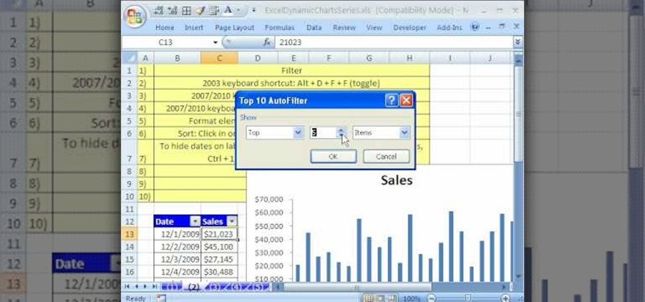
In this Software video tutorial you will learn how to use the filter & sort feature in Excel. First create a column chart on an excel sheet. In this example, it is a date and sales chart. Click alt+F1 and the chart is displayed. Then click and delete the legend and the horizontal lines. Now go back to the data set, click on a cell and click ctrl+shift+L and that will add the auto filter. ctrl+shift+L is for Excel 07. For earlier versions, see the commands listed in the video. This is a toggle...
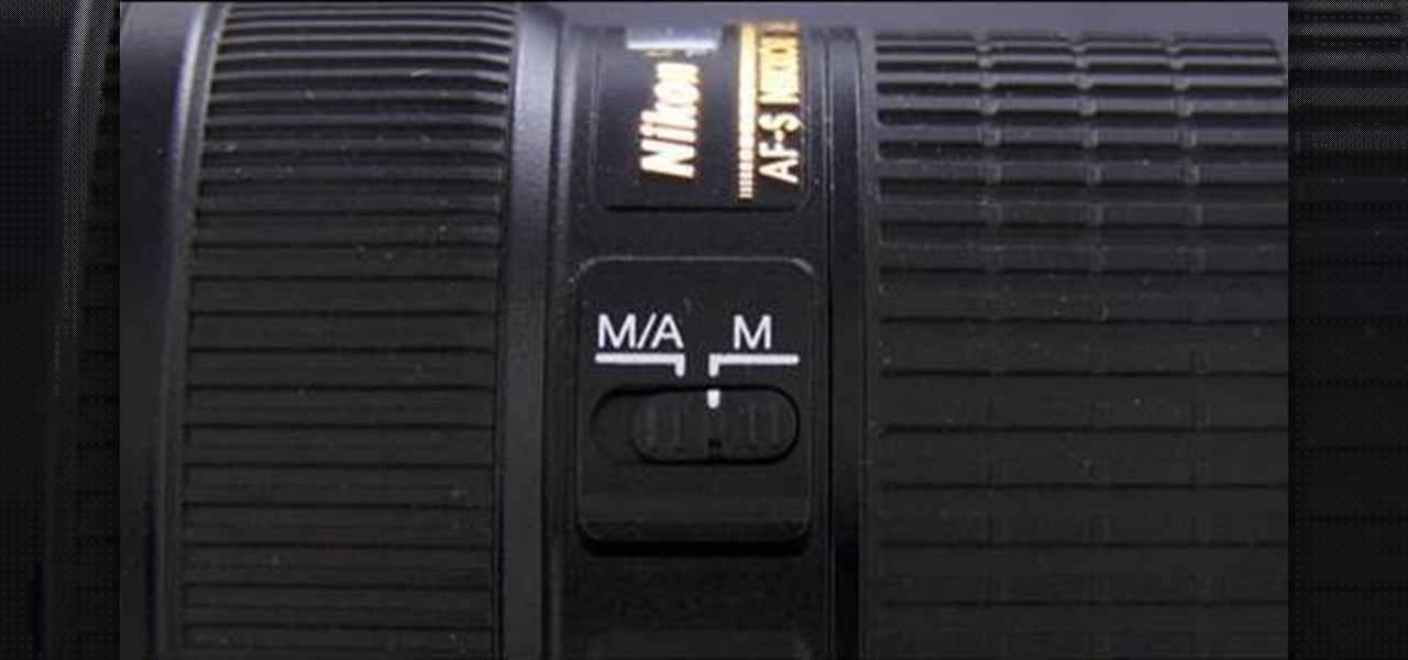
The resolution, or sharpness, of a lens is vital to creating and reproducing quality photographs. Watch as this video breaks down how to diagnose the sharpness of your SLR lenses.
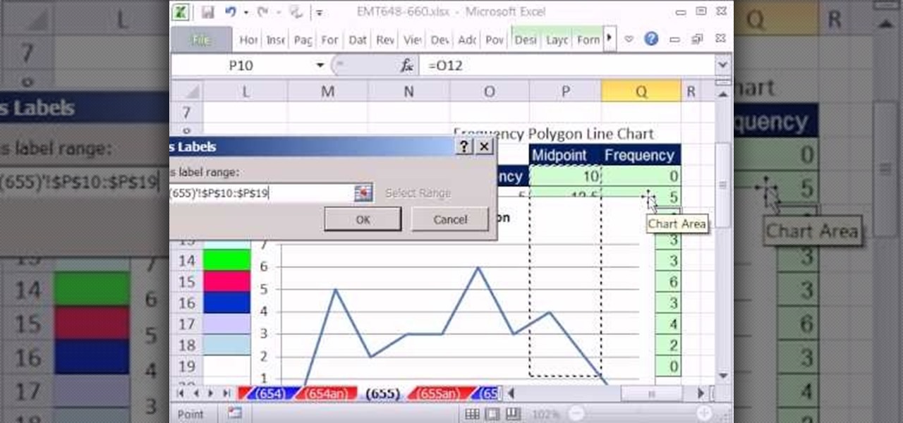
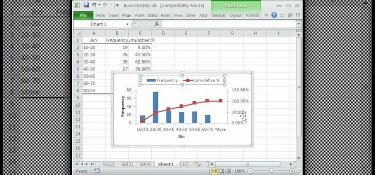
New to Microsoft Excel? Looking for a tip? How about a tip so mind-blowingly useful as to qualify as a magic trick? You're in luck. In this MS Excel tutorial from ExcelIsFun, the 655th installment in their series of digital spreadsheet magic tricks, you'll learn see how to create a statistical frequency polygon using a line chart. Also see how Excel mistakenly interprets number category label data as Number Series data.
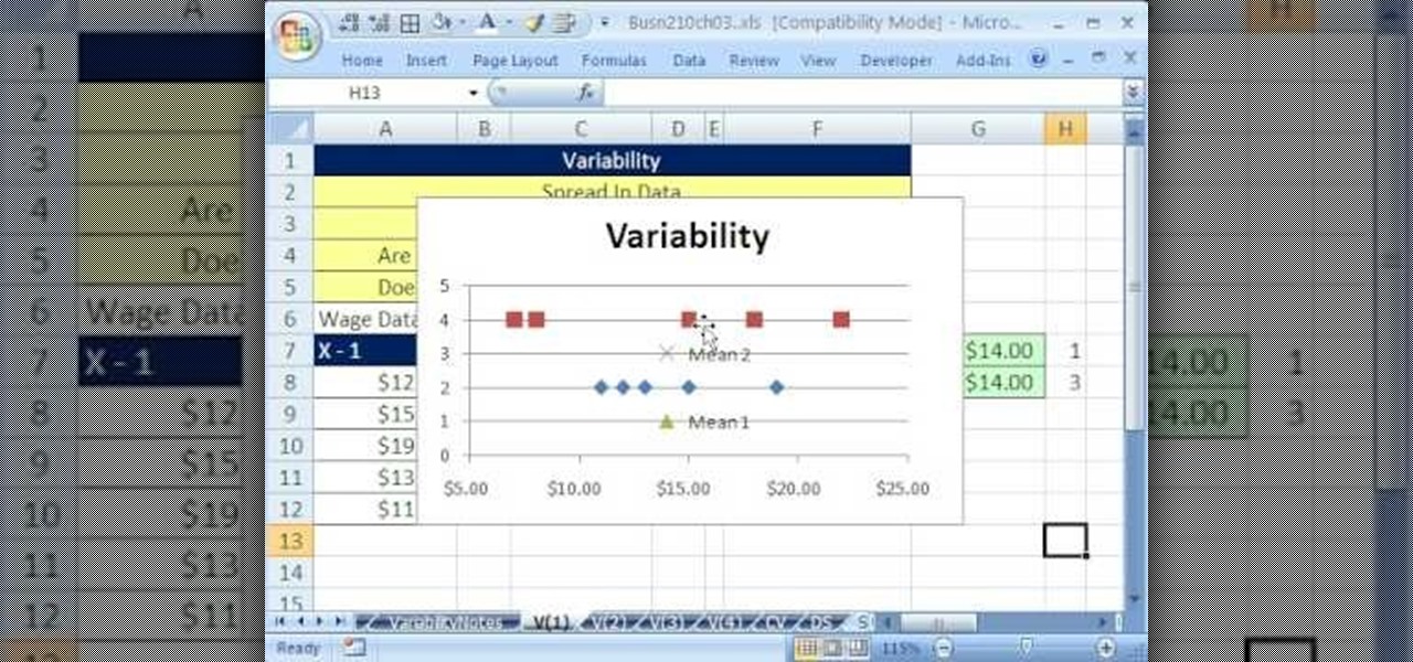
If you use Microsoft Excel on a regular basis, odds are you work with numbers. Put those numbers to work. Statistical analysis allows you to find patterns, trends and probabilities within your data. In this MS Excel tutorial from everyone's favorite Excel guru, YouTube's ExcelsFun, the 39th installment in his "Excel Statistics" series of free video lessons, you'll learn about variability (or dispersion or spread). Create an X-Y Scatter Diagram chart showing data points and the mean.
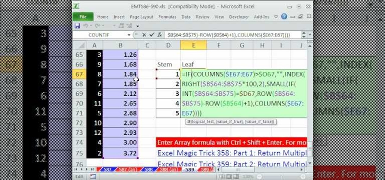
New to Microsoft Excel? Looking for a tip? How about a tip so mind-blowingly useful as to qualify as a magic trick? You're in luck. In this MS Excel tutorial from ExcelIsFun, the 589th installment in their series of digital spreadsheet magic tricks, you'll learn how to create an array formula for a stem and leaf chart for decimal numbers using the IF, COLUMNS, SUMPRODUCT, INDEX, INT, RIGHT, SMALL, ROW and TEXT functions.
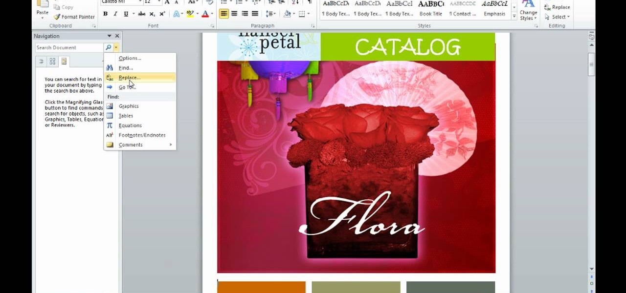
This is an informative video tutorial on how to search graphics, tables and charts using MS Word 2010. The author informs that the earlier MS Word editions had fast and easy search options, but the same feature built into the 2010 edition is vastly improved. One simply has to click the ‘Find’ option at the top right-hand corner and a navigation pane opens on the left-hand side. In the search box, the keyword is typed in and all the instances of that word in the document are highlighted, while...
Learn how to compare numerical figures and create a simple bar chart in Microsoft Excel.
It's often best to use a graphical representation of the data you've assembled or calculated. This tutorial shows you how to create charts to visually show your results.
With hordes of games populating the Google Play Store, it's grown increasingly difficult to find trending, non-gaming apps that you might find useful on your Android device. There are a few in the Top Charts pages, peppered in among the various games you'll never play, but other than that you'll have to do some serious searching to discover any new apps.
The Billboard Charts have been a measurement of commercial success for pop songs since roughly the time that radios became a household item. In its modern form, Billboard ranks the sales and performance of all singles with its "Hot 100" chart, as well as many other genre-specific rankings.
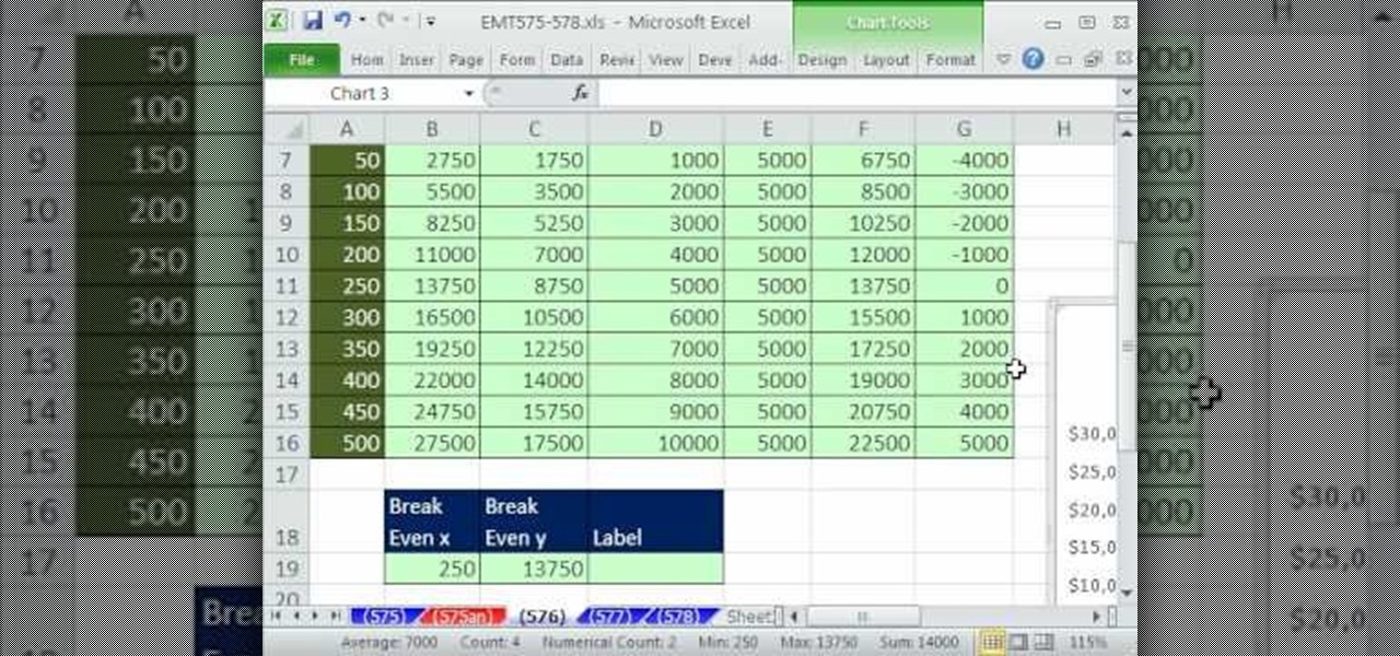
New to Microsoft Excel? Looking for a tip? How about a tip so mind-blowingly useful as to qualify as a magic trick? You're in luck. In this MS Excel tutorial from ExcelIsFun, the 576th installment in their series of digital spreadsheet magic tricks, you'll learn how to add a point and a dynamic label to a break-even chart that marks the breakeven point using INDEX and MATCH functions. This point is dynamic and will change if data is changed.
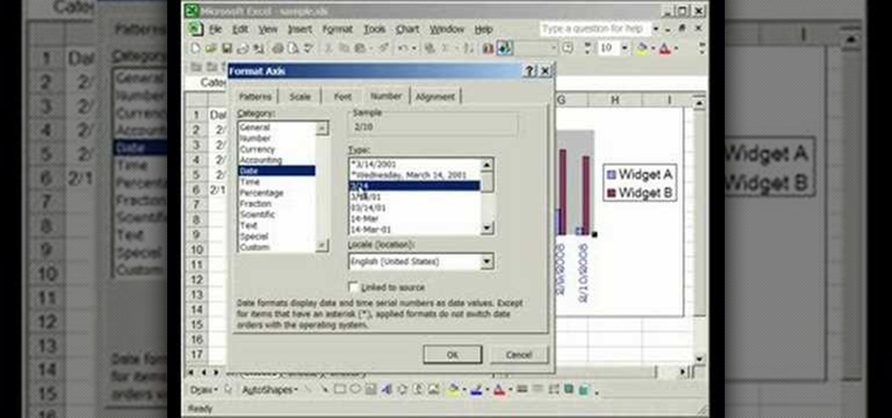
This video is about formatting the charts in Excel especially the x and y axes. The video begins by selecting a chart and right clicking the dates at the bottom of the data points. The format axis window pops up and by making changes to the style, color and the weight of lines given in the patterns tab, you can change the way the x-axis looks like. You can also change appearance of characters appearing close to the x-axis by selecting options in the font menu. You can also change the format o...
New to Excel? Looking for a tip? How about a tip so mind-blowingly advanced as to qualify as a magic trick? You're in luck. In this Excel tutorial from ExcelIsFun, the 477th installment in their series of digital spreadsheet magic tricks, you'll learn how to create a Gantt cell chart using conditional formatting. This is accomplished with recourse to the WORKDAY.INTL, AND, NOT & NETWORKDAYS.INT functions.
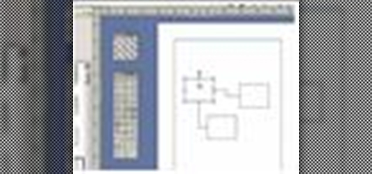
In this video we learn how to use Smart Art graphics including creation of Hierarchal charts, flow charts, modify, adding gradients, style, and colors, in Word 2007. The first step is to click on the Smart Art icon in Microsoft Word 2007. Next, you can scroll through the Smart Art object choices. In this example we first want to click on the Text Cycle icon. Once we do that click on OK and the rough drawing will be placed on your document. After that click on design and you can format the gra...
One of the advantages of an iPad over, say, an iPhone is that you've ample space with which to display and manipulate complex documents. As such, it's a natural fit for Apple's popular spreadsheet application, Numbers. In this video guide from Apple, you'll learn how work with tables, charts, formulas, photos and graphics using the Numbers app on your own iPad.
In this video, we learn how to check your engine health with a PICO scope. First, you will want to attach your computer to the PICO scope that is connected to your vehicle's "brain". After this, you will run through the different sections of the car to see how each of the different functions are running. Compare the results you are getting to a chart that shows what the healthy charts should look like. As you go through these, record the results you get, then print them out if you need to. Wh...
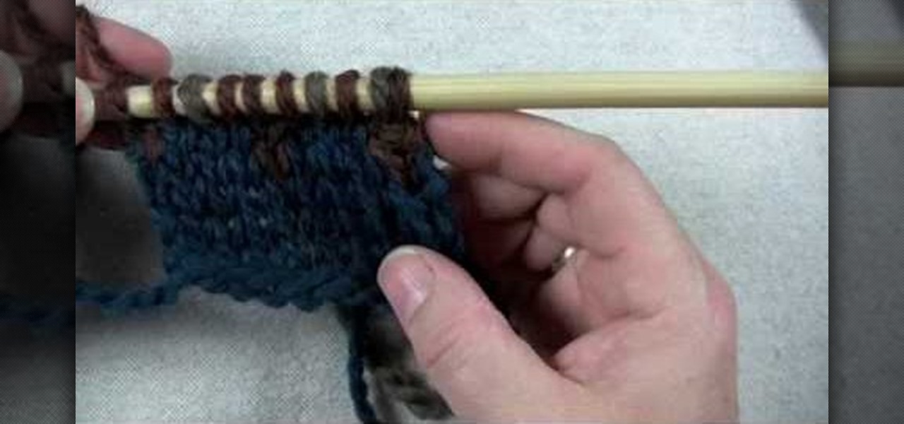
In this tutorial, we learn how to use a stranded color work pattern. Start with a basic pattern to help you learn how to do this. Use a chart to help you keep track of where you are and what you have done. Use a sticky not over the rows so you don't get ahead of yourself. Start off with the color that is first, then continue on to do the other colors that are on that row. When finished with this, remove the sticky note and continue onto the other colors that the chart shows. On the first stit...
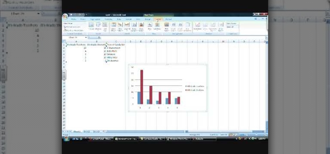
In this Software video tutorial you will learn how to make a basic bar graph in Microsoft Excel. You will also learn how to give your chart a title and how to label the axes. First you put in all your data in to an Excel spreadsheet. Then you highlight the data you want to put in your graph, select the 'insert' tab, then' column' and choose the basic column chart. Next you select the title tab, go to option and choose new title. Now you add the title to the graph. To label the axes, go on top...
New to Excel? Looking for a tip? How about a tip so mind-blowingly useful as to qualify as a magic trick? You're in luck. With this video tutorial from ExcelIsFun, the 376th installment in their series of digital spreadsheet video tutorials, you'll learn how to an array formula for a stem and leaf chart for numbers that have more than two digits. This is accomplished through use of the IF, COLUMNS, SUMPRODUCT, LEFT, RIGHT, FIXED, INDEX, SMALL and ROW functions.
This video demonstrates how to make your own Wiccan runes. You need ordinary, commercially grown lima beans. You can also make smaller ones using smaller beans or you can use river stones. Use a rune chart. These can be found in most New Age shops or you can download one for free online. Choose beans without cracks. Use a marker pen, or a "Sharpie" to mark each rune on one stone or bean. Copy the whole chart. When you have done this you can bless the runes. They can be kept with some sacred s...
This video is an entertaining way of learning how to quantify how much time has elapsed from one point to another. It opens with a mischievous person using an unauthorized computer, claiming he had only been on for a shorter time than what was calculated by the owner. The video then instructs how to figure out such a calculation by creating a T-chart. One the left side of the T-chart, the previous time is shown, along with new times as each hour or minute is added. On the right, the desired t...
Take your dessert from bland and boring to something special for your next dinner party with help from this video! In this cooking tutorial, learn from Sue McMahon, cookery editor at Woman's Weekly, how to temper chocolate. To complete this recipe you will need the following: