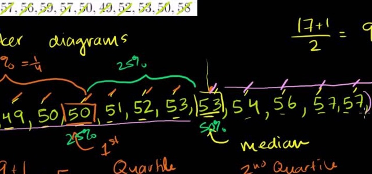
From Ramanujan to calculus co-creator Gottfried Leibniz, many of the world's best and brightest mathematical minds have belonged to autodidacts. And, thanks to the Internet, it's easier than ever to follow in their footsteps (or just study for that next big test). With this installment from Internet pedagogical superstar Salman Khan's series of free statistics tutorials, you'll learn how to use visualize data by graphing it in a box-and-whisker diagram.

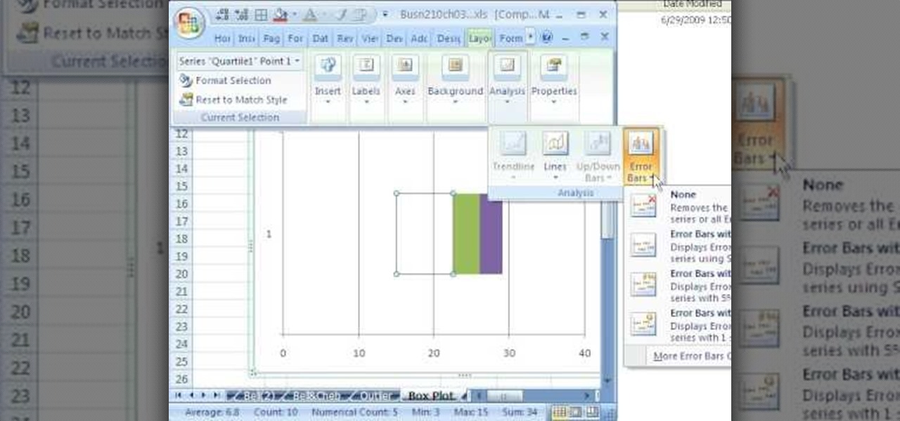
New to Excel? Looking for a tip? How about a tip so mind-blowingly useful as to qualify as a magic trick? You're in luck. In this Excel tutorial from ExcelIsFun, the 124th installment in their series of digital spreadsheet magic tricks, you'll learn how to create a box plot or box-&-whisker chart using a stacked bar chart and a open-high-low-close stock chart. You'll also learn how to use the QUARTILE function.
If you use Microsoft Excel on a regular basis, odds are you work with numbers. Put those numbers to work. Statistical analysis allows you to find patterns, trends and probabilities within your data. In this MS Excel tutorial from everyone's favorite Excel guru, YouTube's ExcelsFun, the 27th installment in his "Excel Statistics" series of free video lessons, you'll learn how to create a quantitative data dot plot chart using the REPT and COUNTIF functions.

When you are solving inequality for a rational function you don't do it the same way as you would solve an equality. Now the instructor shows how to solve an inequality with the help of an example. Now to solve an inequality which is in the form a/b first take the numerator and denominator as separate equations of two lines. Now graph the two lines on coordinate axes. Using the graphs of the lines plot the intercepts of the equations on the number line noting down the sings. Now you can compa...

New to Microsoft Excel? Looking for a tip? How about a tip so mind-blowingly useful as to qualify as a magic trick? You're in luck. In this MS Excel tutorial from ExcelIsFun, the 351st installment in their series of digital spreadsheet magic tricks, you'll learn how to create an area chart for x and f(x) data as well as how to use the IF function to show a second data set plotted to show a specific area section.
From Ramanujan to calculus co-creator Gottfried Leibniz, many of the world's best and brightest mathematical minds have belonged to autodidacts. And, thanks to the Internet, it's easier than ever to follow in their footsteps. With this installment from Internet pedagogical superstar Salman Khan's series of free math tutorials, you'll learn how to visualize statistical data with a hand-drawn stem-and-leaf chart.

If you think about it, your face is just another canvas, with makeup being the paint. You add highlights here to bring parts you want to emphasize forward, bronzer there to create fake shadows, and draw on patches of color (lips) or lines (eyes) to make things either pop or recess.
If you have a circular or semicircular protractor like the one used in this video, making a pie chart is as easy as – well — pie. This will teach you how to use your protractor to measure out each individual slice in your pie chart. Learn how to visualize statistical data through hand-drawn pie charts with this free video math lesson.
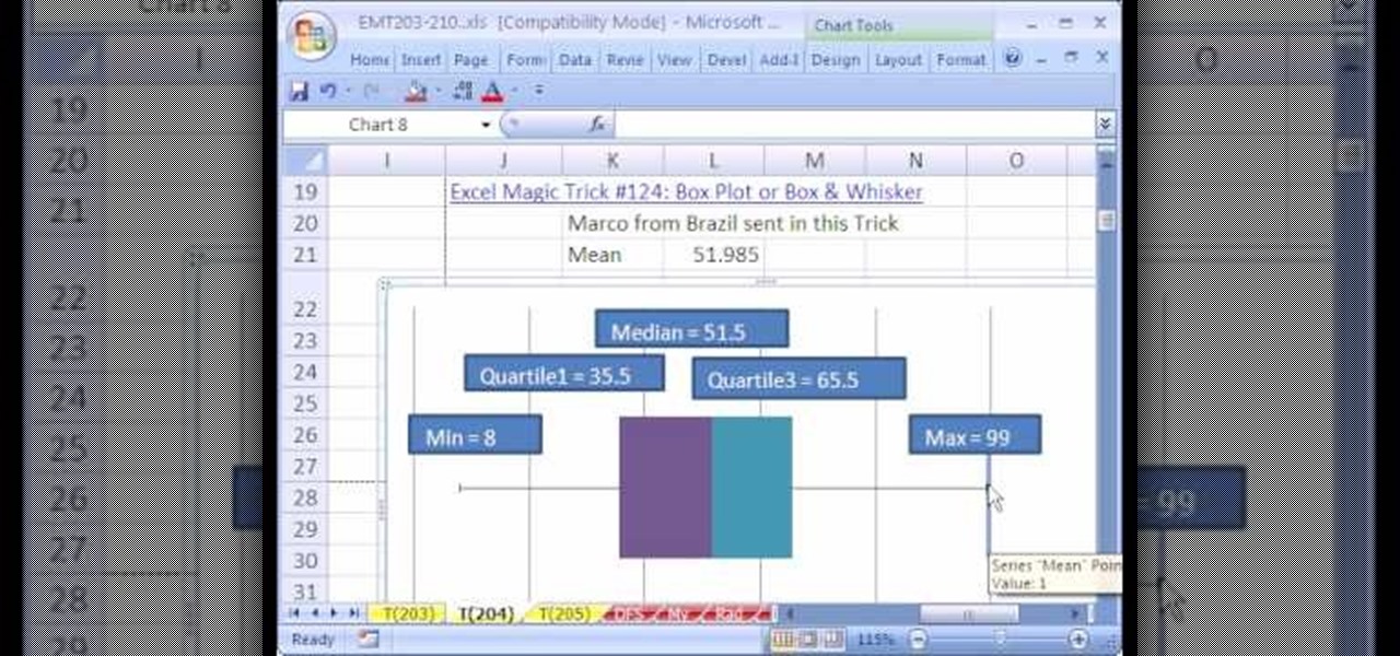
New to Microsoft Excel? Looking for a tip? How about a tip so mind-blowingly useful as to qualify as a magic trick? You're in luck. In this MS Excel tutorial from ExcelIsFun, the 204th installment in their series of digital spreadsheet magic tricks, you'll learn how to add a mean value as a scatter diagram data series to a box plot or box & whisker that is set up as a bar chart.
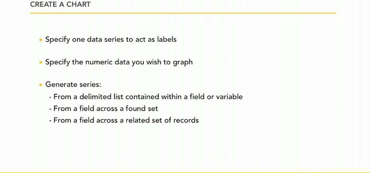
In this video the instructor shows how to create charts and graphs in Microsoft Word. First, open the Word document and select an area to insert the charts. Now go to the Insert tab in the ribbon and select the Chart icon. The Insert Chart window opens up with various chart templates. There are various categories of charts like Line, Pie, Bar in the left hand side. In the right hand side you can see the sample charts available and you can select any of them that you want. Now it transfers you...
Learn how to crochet using a graph or chart in this six part vieo tutorial series. Filet crochet is lacy stitch - an easy technique - that can have beautiful results. Filet crochet patterns are usually made up of open meshes & solid meshes. Get the free simple heart chart used in this video here.
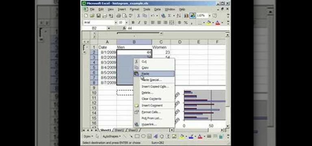
In this tutorial, we learn how to make a histogram chart in Excel. To create a vertical histogram, you will enter in data to the chart. Then, highlight all of the data and go to "insert", "chart", then choose a regular column chart. Grab a regular 2D column and then make sure your values are correct. Then, right click and go to "chart options", then take the legend off. Now, make these columns all touch each other by right clicking over the columns and formatting them. Go to "options" then ch...
In order to format graphs and charts using Microsoft Word 2007, click on Chart Tools. The tabs at the top of the screen provides you with your options. You can change the type of chart or graph by clicking on Change Chart Type. If there is a particular type of chart that you would like to use again and again, then you can save it as a template via the Save As a Template icon. You can edit the data in your chart of graph by clicking on Edit Data. You can modify the chart layout by clicking on ...
Whether you're interested in learning Microsoft Excel from the bottom up or just looking to pick up a few tips and tricks, you're in the right place. In this tutorial from everyone's favorite digital spreadsheet guru, ExcelIsFun, the 5th installment in his "Highline Excel Class" series of free video Excel lessons, you'll learn how to create seven types of charts — X-Y scatter diagrams, pie charts, column charts, bar charts, stacked bar charts, line charts, and column and line chart combined. ...
In this five-part video tutorial, learn how to double crochet intarsia using a graph or chart. Intarsia knitting is an advanced knitting method, used to knit with several colors of yarn. The simple heart chart used in this video is available here.
If you use Microsoft Excel on a regular basis, odds are you work with numbers. Put those numbers to work. Statistical analysis allows you to find patterns, trends and probabilities within your data. In this MS Excel tutorial from everyone's favorite Excel guru, YouTube's ExcelsFun, the 49th installment in his "Excel Statistics" series of free video lessons, you'll learn how to find outliers with the +/- 3 Z-score rule and the ABS function. See how to do a box plot by hand and in Excel. For th...
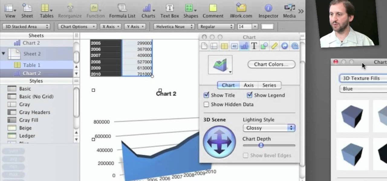
Check out this informative video tutorial from Apple on how to create and edit charts in Numbers '09.
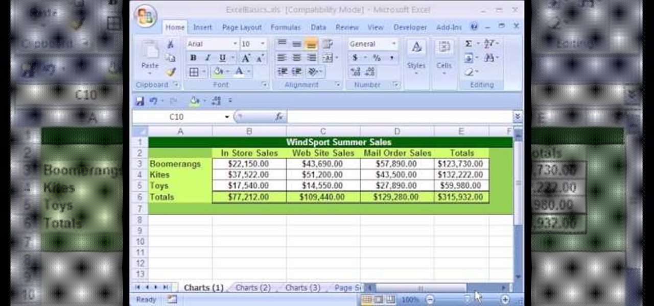
In this Excel basics video, the instructor talks about the basics of charts. There is an enormous difference in how you make charts between Microsoft Excel 2003 and 2007. In both the versions, to make charts the first thing you do is highlight the data cells in your workspace. Now use the toolbar and click on the charts button there. Now Excel automatically generates the charts based on the data and the column and row names. But there are various changes between the charts produced in the dif...
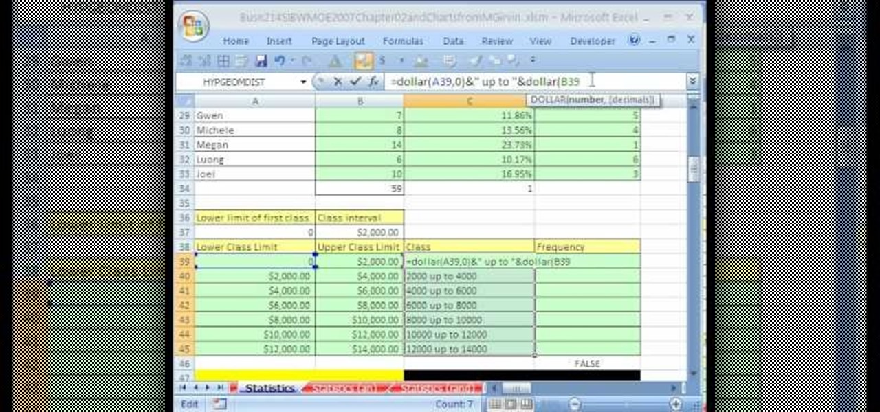
Whether you're interested in learning Microsoft Excel from the bottom up or just looking to pick up a few tips and tricks, you've come to the right place. In this tutorial from everyone's favorite digital spreadsheet guru, ExcelIsFun, the 31st installment in his "Highline Excel Class" series of free video Excel lessons, you'll learn how to build frequency tables and simple histogram charts in Microsoft Excel. Specifically, this video addresses the following subjects:
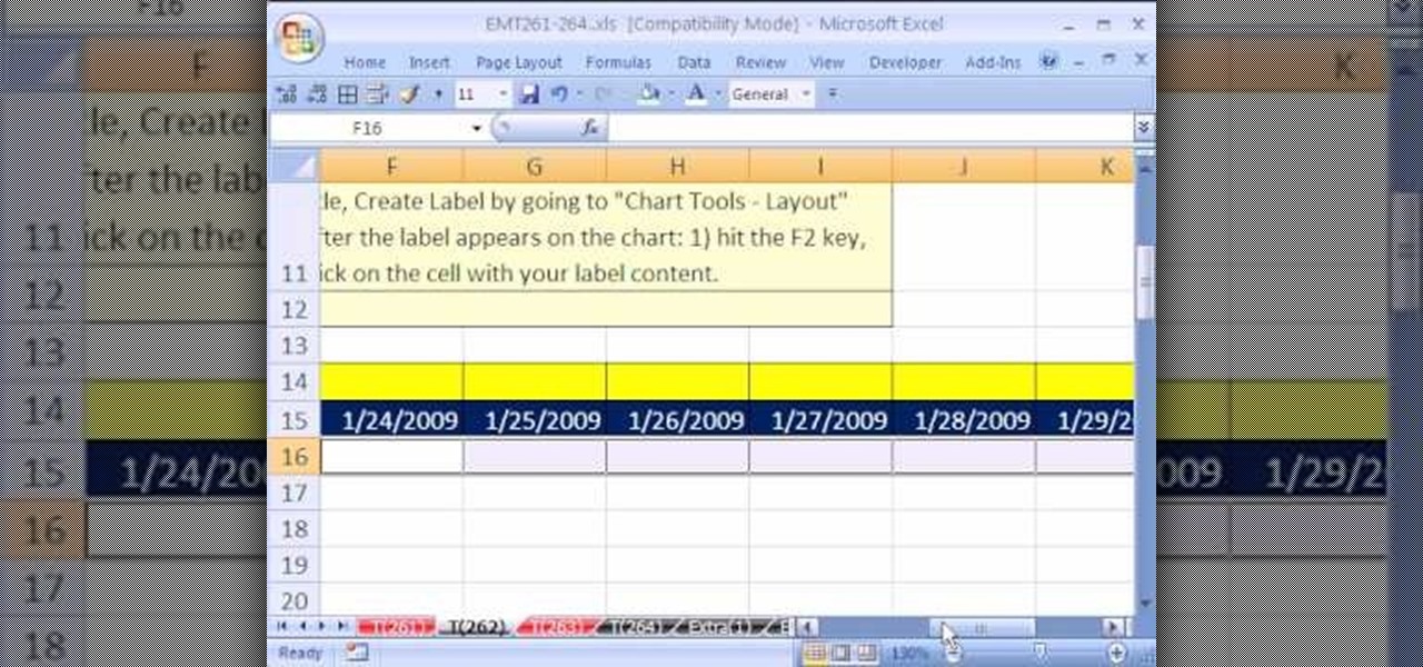
This video is from HelpVids and describes how to change the axis titles on charts in Microsoft Word 2007. To access the chart tools, select the chart and the tools will appear above the ribbon. There are many different design options that you can preview on the screen to make your final selection. To change the chart title, click on the Chart Title button which is located on the Layout ribbon. You can then select where you would like the title to appear. Once you select the location you can t...
Namuoc demonstrates how to create a line chart in Excel. To create a simple line chart in Excel 2007, first highlight the cells in your worksheet that you would like to include in the chart. Then, select the insert tab on the top of the worksheet toolbar. Next, click on the line option. Select the two dimensional line graph option from the given choices. Move the chart to a new sheet. Label the new sheet in the appropriate field and click the OK button. Your line chart will now be created usi...
New to Excel? Looking for a tip? How about a tip so mind-blowingly advanced as to qualify as a magic trick? You're in luck.
If you use Microsoft Excel on a regular basis, odds are you work with numbers. Put those numbers to work. Statistical analysis allows you to find patterns, trends and probabilities within your data. In this MS Excel tutorial from everyone's favorite Excel guru, YouTube's ExcelsFun, the 22nd installment in his "Excel Statistics" series of free video lessons, you'll learn how to create a percent (%) cumulative frequency distribution with formulas, a histogram and an ogive chart. See how to add ...
Dull and drab bulleted lists are no longer necessary with the help of PowerPoint 2008 for Mac. When you make a bullet list in PowerPoint, you can now transform those boring text charts with actual visual charts and graphs and more. The Microsoft Office for Mac team shows you just how to convert text to a SmartArt graphic in this how-to video.
Check out this tutorial and learn how to create chars in Excel 2007. In Office Excel 2007, you just select data in your worksheet, choose a chart type that best suits your purpose, and click. Want to try a different chart type? Just click again and select a new chart type from a huge range of possibilities. Then work with the new Chart Tools to customize the design, layout, and formatting of your chart. You can see how various options would look just by pointing at them.
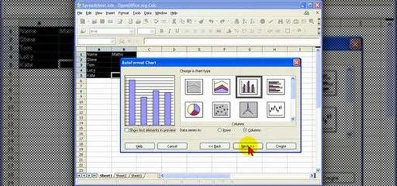
In this screencast tutorial, Steve shows you how to quickly and simply create a bar chart, from the data you have entered into your worksheet in Open Office Calc. If you're looking for a simple and clear way to represent your statistical data, then a simple bar chart is an option you should look at using. So check out this tutorial and start making OpenOffice Calc bar charts today.
In this video tutorial, you'll learn how to generate and customize the look of simple charts within the iWork '09-version of Numbers. For all the details, including step-by-step instructions, and to get started creating your own charts, take a look.
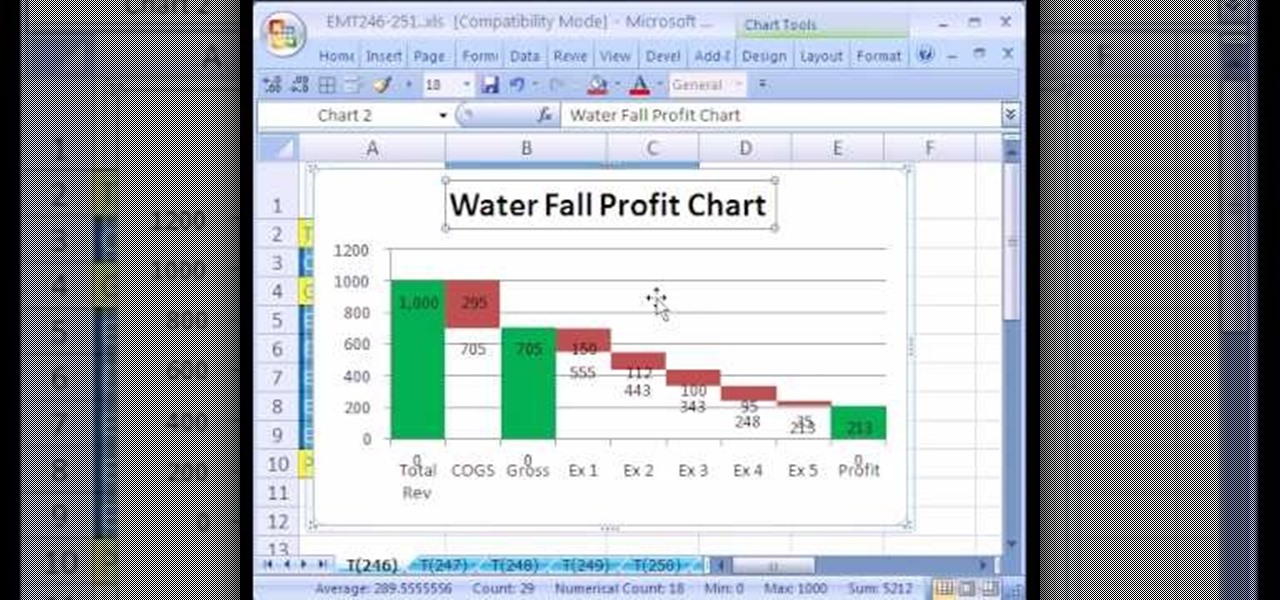
New to Excel? Looking for a tip? How about a tip so mind-blowingly useful as to qualify as a magic trick? You're in luck. In this Excel tutorial from ExcelIsFun, the 246th installment in their series of digital spreadsheet magic tricks, you'll learn how to create a waterfall profit chart from a stacked column chart.
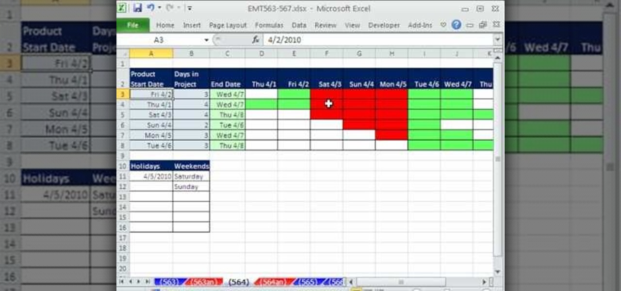
New to Excel? Looking for a tip? How about a tip so mind-blowingly advanced as to qualify as a magic trick? You're in luck. In this two-part Excel tutorial from ExcelIsFun, the 564th installment in their series of Excel magic tricks, you'll learn how to create a cell chart using conditional formatting with Logical TRUE FALSE formulas to create a Gantt Chart. Functions used include WORKDAY, AND, NOT, NETWORKDAY.
This video will show you how to create a flow chart in MS Word 2007. First click on the Insert tab. You can see the smart art option, click on it. A "Smart Art Graphic" window will appear.
Xtracharts, a control for Winforms, allows the user to easily export charts made using the program into a PDF, HTML or MHT, Excel spreadsheet or standard image. This tutorial shows the Winforms user how to properly code and then export the chart.
In almost all charts and forms of sheet music, the composer will more than likely have added rhythmic dictation to the staff, a specific rhythm that he wants you to play over the progression using the chord. In this video you will get a breakdown of basic rhythmic dictation of a quarter note, eighth note and more on top of how to read these in notation format!
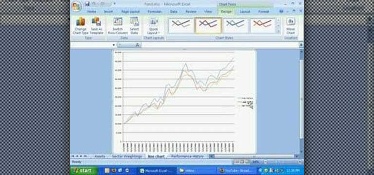
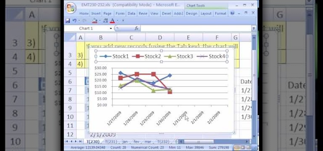
New to Microsoft Excel? Looking for a tip? How about a tip so mind-blowingly useful as to qualify as a magic trick? You're in luck. In this MS Excel tutorial from ExcelIsFun, the 230th installment in their series of digital spreadsheet magic tricks, you'll learn how to use the Excel List Table feature to make a dynamic stock price line chart.
In this episode, Steve shares some knowledge he's gained through working on no-budget movies to help keep production smooth and professional. With hits from Jared like "How to Properly Clean Your Lens the Night Before a Shoot", this episode is sure to hit #1 on the Billboard Charts for podcasts! What? Billboard doesn't chart podcasts!?!
New to Microsoft Excel? Looking for a tip? How about a tip so mind-blowingly useful as to qualify as a magic trick? You're in luck. In this MS Excel tutorial from ExcelIsFun, the 637th installment in their series of digital spreadsheet magic tricks, you'll learn how to create a dynamic two data series line chart for blood pressures — how to look up a chart using defined names, a data validation list, and a formula using the INDIRECT function inside a picture of a chart.
Whether you're interested in learning Microsoft Excel from the bottom up or just looking to pick up a few tips and tricks, you've come to the right place. In this tutorial from everyone's favorite digital spreadsheet guru, ExcelIsFun, the nth installment in his "Highline Excel Class" series of free video Excel lessons, you'll learn how to create and use simple charts in MS Excel as well as see how to use Excel's SUMIFS & AVERAGEIFS functions. Specifically, this video covers the following topics:
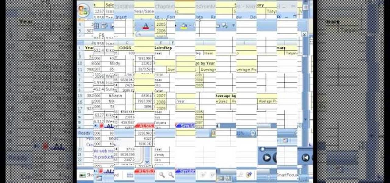
Looking for a guide on how to set up charts within FileMaker Pro 11? Look no further. Whether you're new to the FileMaker Pro database management program or just want to learn how to take advantage of FileMaker Pro 11's new features, you're sure to benefit from this free video tutorial from the folks at Lynda. Specifically, this software tutorial provides a complete overview of how to work with chart and graph settings in FileMaker Pro 11.
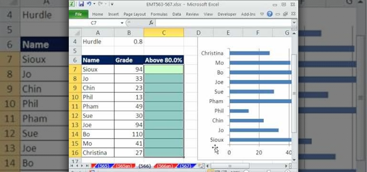
New to Microsoft Excel? Looking for a tip? How about a tip so mind-blowingly useful as to qualify as a magic trick? You're in luck. In this MS Excel tutorial from ExcelIsFun, the 566th installment in their series of digital spreadsheet magic tricks, you'll learn how to use the IF functions and a bar chart to create a conditionally formatted chart for students scores that exceed a given hurdle.
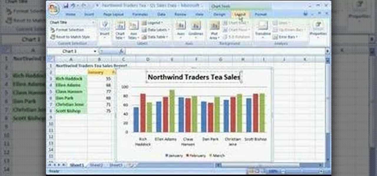
New to Microsoft Excel? Looking for a tip? How about a tip so mind-blowingly useful as to qualify as a magic trick? You're in luck. In this MS Excel tutorial from ExcelIsFun, the 2nd installment in their series of digital spreadsheet magic tricks, you'll learn how to create charts via keyboard shortcut as well as how to create dynamic charts with cell references.
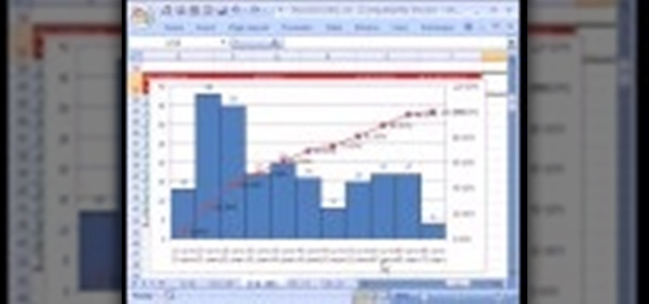
This tutorial shows you how to use an Excel to create a project management Gantt chart. There is no default for this, but you can customize a stacked bar chart to do the job.