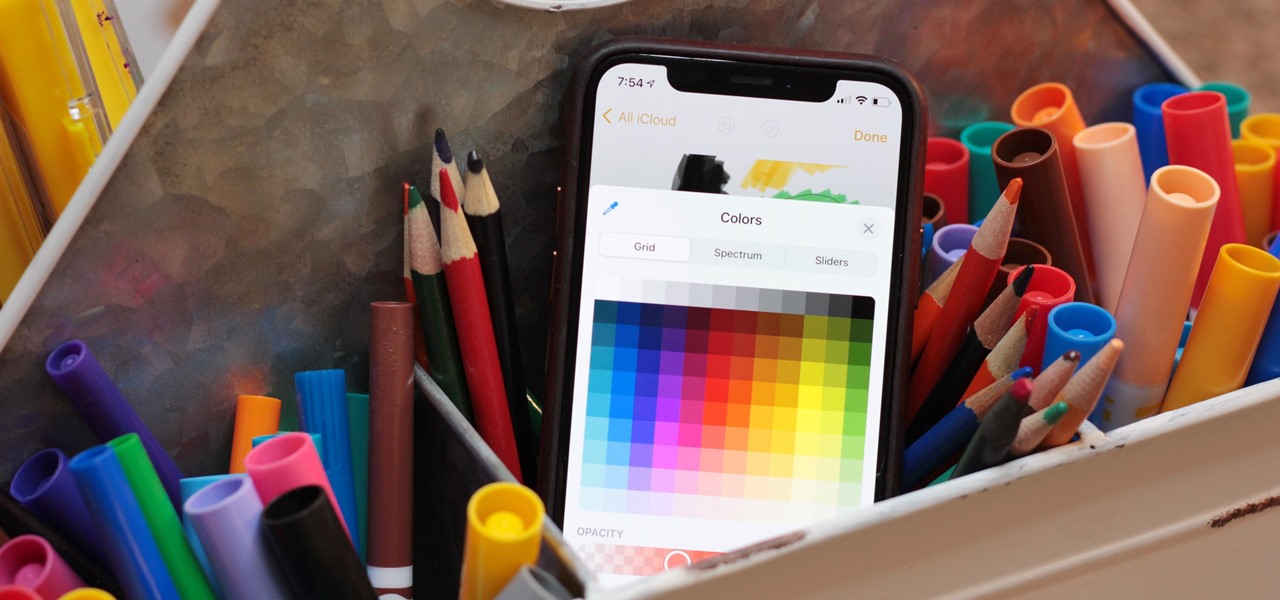
Whether you're using your iPhone to add graphics to a document, edit a photo, or sketch an idea, color plays a vital role in making your work look great. Apple's iOS 14 update introduces a system-wide color picker that lets you pick the exact color you want, save it to your favorite colors, and use it across a variety of apps to add that special touch to your work.
One of the more competitive aspects to chat apps these days is customizability. It seems every messenger wants to offer the largest number of options for users to make the app feel like a truly personal experience. Telegram is no stranger to this customizability, offering tools where you can select backgrounds and chat bubble colors.
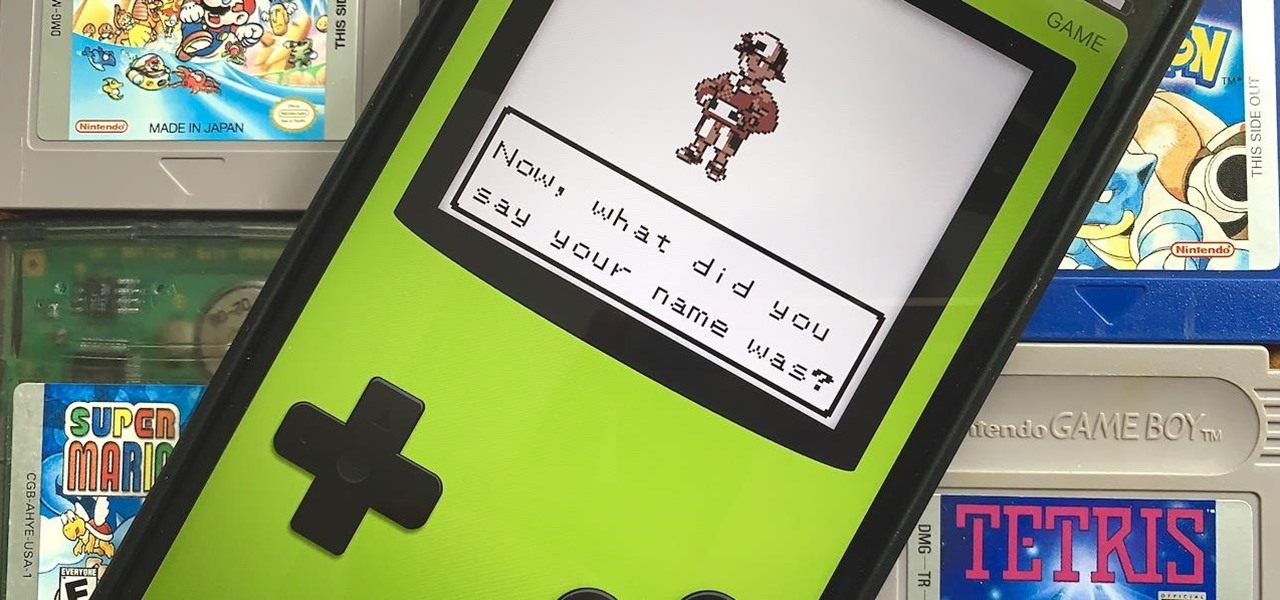
Nintendo may be developing cases that'll turn your iPhone into a gaming device like the Game Boy, but until something materializes there, you're stuck with cheap knockoffs on Amazon or a real Game Boy or Game Boy Color. But there's something else you can do to play eight-bit Nintendo games on your iPhone right now.
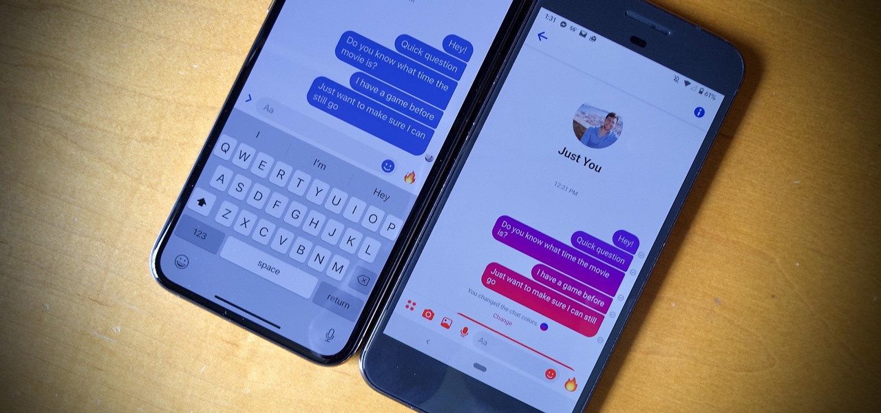
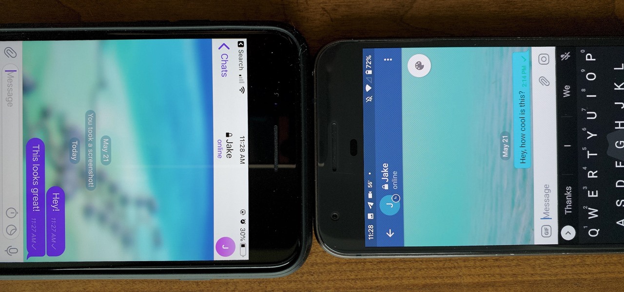
Blue has defined Facebook's color scheme since its inception. Both Facebook's main app and Messenger theme are blue, which means your chat bubbles, like emoji, and menu bar items are also. While certainly a satisfying color for chat, you may get sick of it after a while, especially when it's in every thread. Luckily, Facebook lets you customize the color of individual Messenger chats.
There aren't many iPhone apps that let you change their color theme beyond light and dark appearances. They really don't need to either because iOS has a few hidden tricks up its sleeves to help you customize any app's colors either during a specific session or every time you use the app.
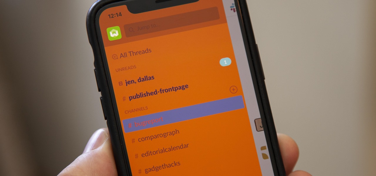
For some reason, the Slack app on Android and iOS is a little less customizable than Slack on other platforms, so you can't adjust the sidebar theme to different colors directly inside the app. But that doesn't mean you can't customize the look of your mobile app at all. It's just a little less convenient.

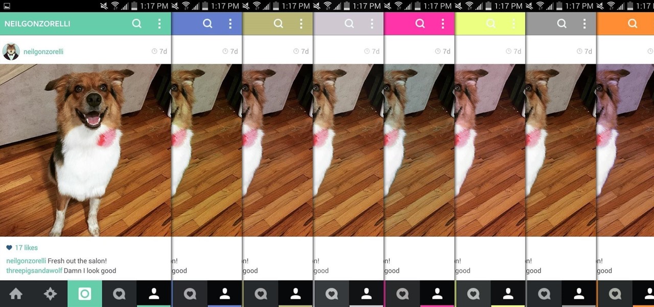
There aren't many complaints I can think of when it comes to the Instagram interface, and finding one would just be nitpicking. But like with most things in life, if given the opportunity, why not take advantage? "When in Rome," as they say.
Facebook has always been notoriously difficult to customize. Personally, I think this is an improvement over MySpace's totally open platform (some people should not use code), but users should still have the option to change a few things if they want. While you'll never be able to choose your own background image or add an obnoxious number of aWeSoMe quiz results to your profile, there are a few browser plugins that let you at least change the color scheme.
Imagine an Instagram feed filled with a wild array of vivid color. Beautiful right? But when you look at the photos in your iPhone or Android phone's albums, they're all just too dull to pull off that dynamic look. There's no doubt that colorful images are more eye-catching than dull ones, so how do you get your photos to overflow with vibrant color? The answer: Add it in post.
If you're anything like me, you use the Calculator app on your iPhone like fifty times a day, and you're sick of the same user interface it's had since iOS 11 came out. While you can't mod the button shapes and sizes, there is a way to breathe new life into your calculations with some Calculator theming.
Welcome! Today I would like to share a few hints about picking the right color. So, if you do not know what color your today's outfit should be or your or which color you should choose for your room walls, please follow my suggestions.
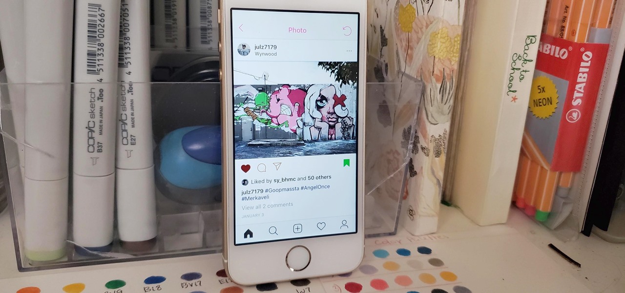
Your Instagram feed is jam-packed with interesting and lively photos, videos, and stories that largely offset the iOS app's comparatively bland user interface. If the interface's dull colors have always bothered you, you can splash on some much-needed color to better reflect your personality and tastes.
If you're tired of the default yellow link colors in your Notes app, which I find hard to look at in light mode, there's a way to change them to another color on your iPhone, iPad, and/or Mac.
On Instagram, you can write text over any picture or video in your Story, but it may be hard to get your message across with a distracting background. Although there is a "Type" option for Stories, which allows you to write text over colorful gradient backgrounds, the selection is limited to just over twenty options, and there are no options for solid colored backgrounds or translucent overlays.
No matter how good a display is, the idea of perfect color calibration is subjective — some prefer warmer more saturated colors, while others prefer the calmer cooler side of the color spectrum. It is almost impossible to create a single color calibration that everyone can agree on out of the box. The display on the Pixel 2 XL was specifically calibrated with a more realistic color profile in mind.
The Galaxy S8 Oreo Beta has been out for just over a week now. Over that time, we've taken a look at some of the best new features and improvements. One area of smartphone software that never gets much love in updates is the lock screen. Samsung changes that in the Oreo beta, bringing new colorization options that match lock screen info to your wallpaper.
When it comes to theming your Android device, it's the little things that matter most. Whether you're tweaking your navigation buttons or changing the color of system menus, no theme is complete until even the smallest element matches the rest of your color palette.
The status bar is an omnipresent force on our Samsung Galaxy S3s; always there to give us that vital information about battery life, date and time, Wi-Fi access, and much more. But there's just something about that default black bar that's so...boring.
With the Android 4.4 KitKat update slated for release sometime in October (according to Nestle), I'm sure you're excited to get your hands on and test out all of the new features of Google's latest mobile operating system.
Snapchat has built upon the photo-sharing service it once was to become a money-sending, commercial-shelling, video-messaging giant. They improved their user experience by adding Stories, Geofilters, and even the rarely-used Snapcash feature, but why isn't there something as simple as color filters? Yes, they have filters for black and white, saturated, and sepia, but that's it as far as color goes.
These days, the user experience on stock Android is a lot more refined and polished than manufacturer skins like Samsung's TouchWiz or HTC's Sense. This is mostly due to Material Design, the look and feel that Google implemented back in Android Lollipop, which has finally started to give Android a unified appearance with its sleek icons and abundant use of colors.
One of the many additions that appear on Android 5.0 Lollipop is a handy menu that lets users correct for or simulate different types of color blindness. While Google didn't flip the switch on this new feature until Lollipop was released, it turns out they had been working on it for quite some time.
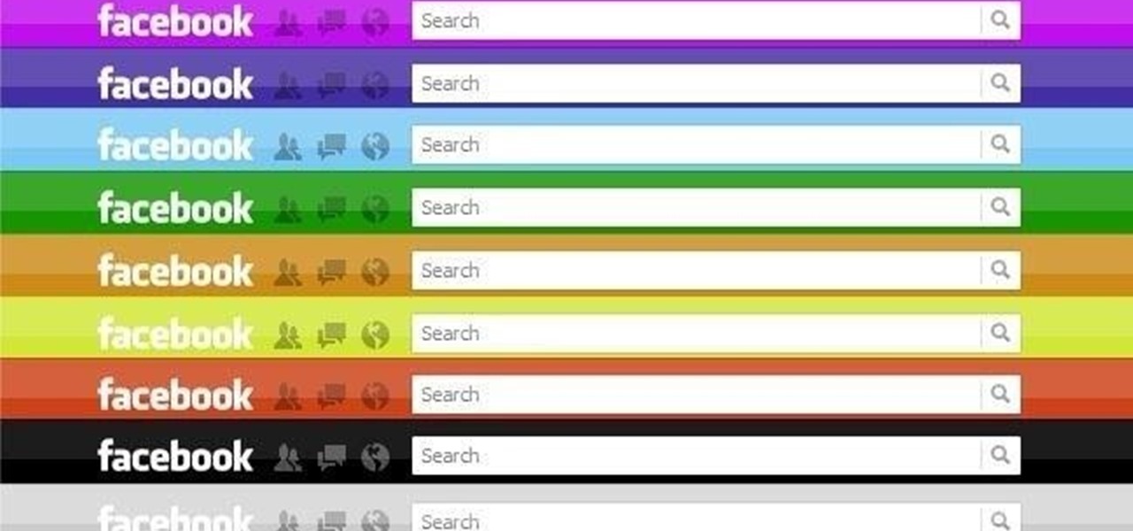
My favorite color is blue, but if everyone I knew said the same thing, I'd probably switch to red—there's nothing cool about uniformity. One place I'm guaranteed to see plenty of my favorite hue is on Facebook. The social network has gone through many redesigns, but its signature color scheme has never changed. While Facebook introduced cover photos, which allows for a little more creativity on your Facebook page, everything else is pretty much the same across all one billion plus profiles. B...
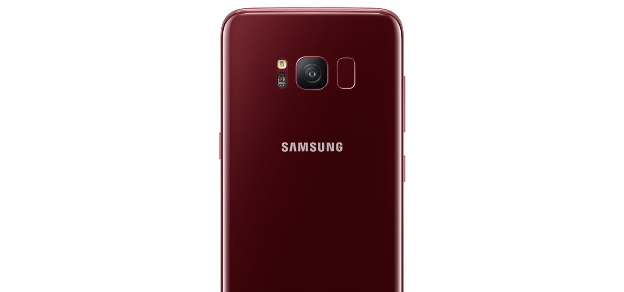
Samsung just announced that the Galaxy S8 is getting a fresh coat of paint, launching a burgundy red color of the flagship in their home market of Korea. There is currently little information about whether this color will come to the US for the S8, but this could be a preview of things to come. The Galaxy S9 is set to arrive in January and may also come in a beautiful red variant.
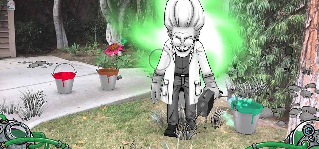
Mobile game companies Hit Point Studios and Legacy Games have adapted their Color BlastAR augmented reality game for iOS with the ARKit platform.
Legacy Games, developer of mobile games for children, has just updated Crayola Color Blaster, an augmented reality Android adventure for Google Tango devices, with new content.
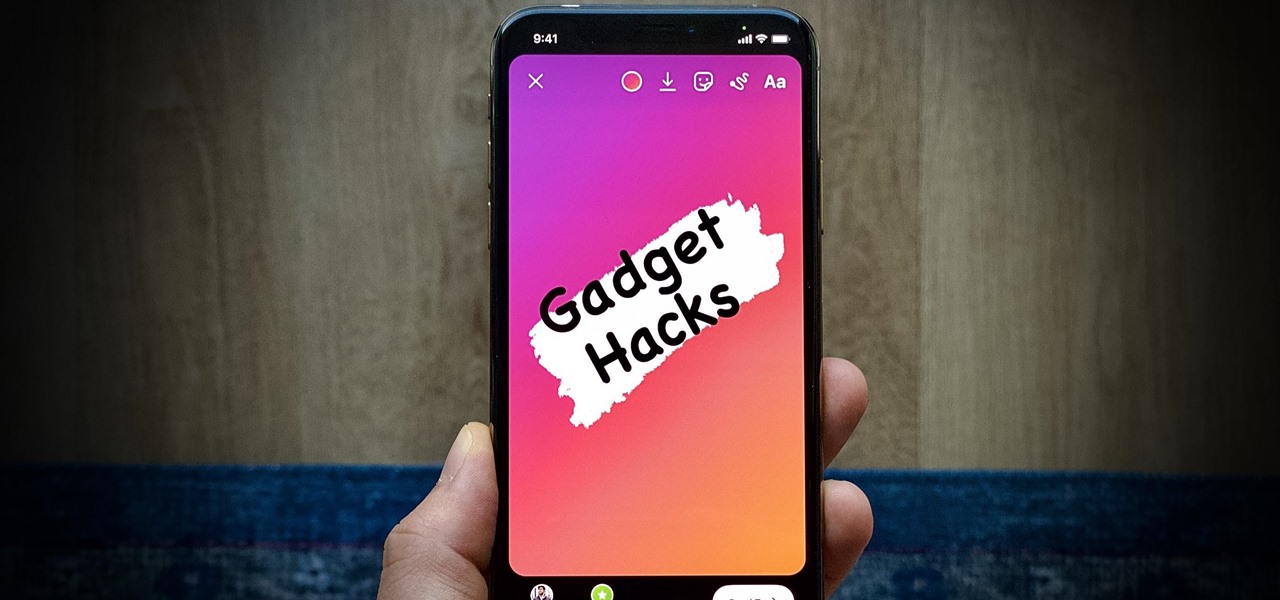
Instagram is all about the hook. If you want followers to stick around, you need to keep your content interesting and engaging. Rainbow text can really make your Stories pop, but it's not really an Instagram "feature," meaning it's not an easy task to accomplish. There is, however, an easy hack that takes all the work out of rainbow-colored text, making your Stories better overall.
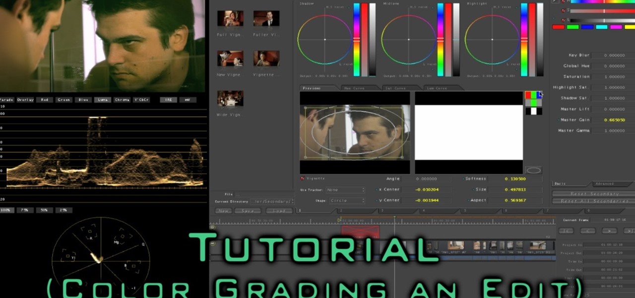
Hey Everybody, I have uploaded a new video tutorial on: How to Color Correct / Color Grade an entire sequence using Final Cut Pro 7 and Apple's Color.
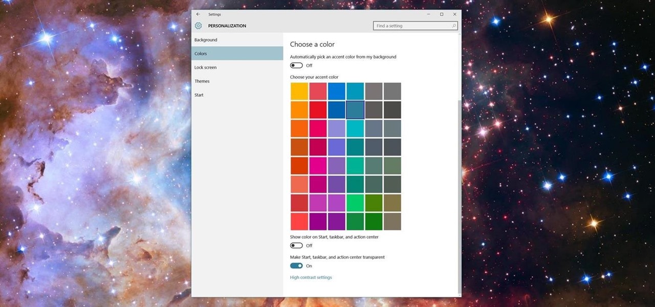
Microsoft has been listening to user feedback, and they've finally done something about one of the most common minor gripes with Windows 10. As of build 10525, there's now an option for changing the title bar color in apps, so you won't have to use this old workaround to personalize your window coloring anymore.
Aside from the most basic functions, most of us are pretty useless when it comes to Photoshop. Yes, we can all add filters, but who wants to see everything in black-and-white or sepia? Why not change a sunflower blue, your hair pink, or your lips purple—without having to spend hours with editing software.
In a similar vein to Facebook's colorful backgrounds for text posts, Instagram has a way to add vivid text-only status updates for your stories. That way, you can conjure up colorful stories that make a statement without even needing to take a photo or video in the first place. And now there are even more fonts to choose from.
The OnePlus 5T is a great device. However, for those of us in the States, we're pretty limited when it comes to OnePlus color choices. While we can pick one of two different spec models, both come in the same Midnight Black. Thankfully, OnePlus has just changed that, releasing a brand new color to our region — but it just sold out.
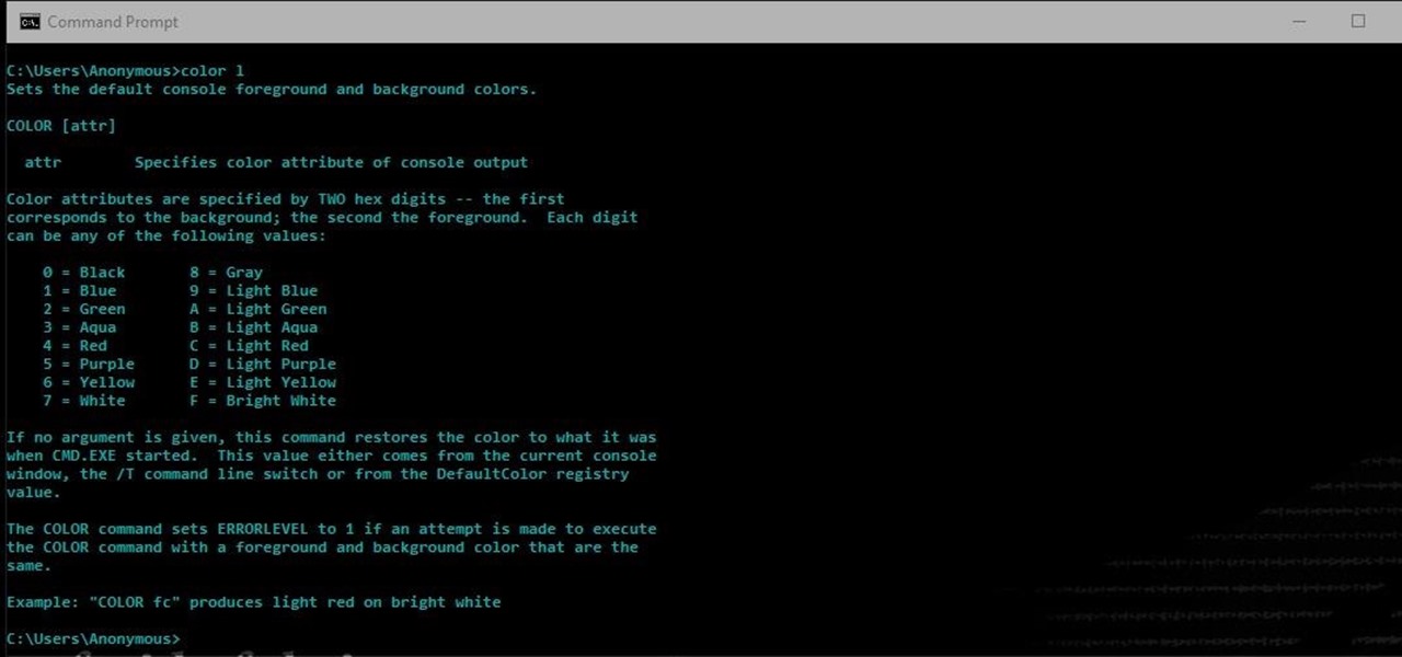
Another series I am now starting, might have to slow down on all of these series, but why tf not. What Is CMD?
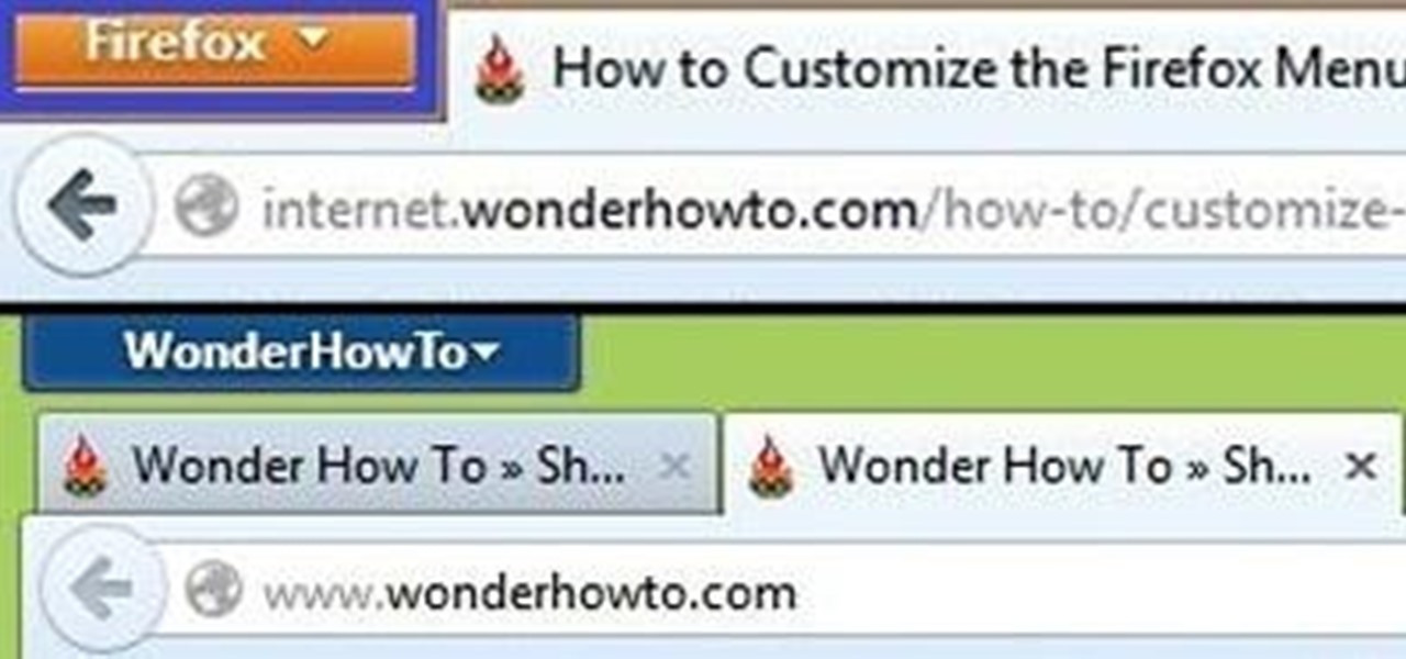
Browser customization is one of Firefox's best attributes. You can personalize your Firefox with extensions, add-ons, themes, and so on. And if all of that still doesn't cut it, you can even customize the Firefox Menu button to say whatever you want. To start off, you'll need to download a user file editor called ChromEdit Plus. Click Add to Firefox, then hit Allow when prompted and wait for it to install. You will need to restart Firefox afterwards.
Few apps on the iPhone give you ways to change their color scheme aside from Dark Mode in iOS 13 and later, but that doesn't mean you can't give an app a new color theme or filtered look. With the Shortcuts app in iOS 14 and later, it's totally possible, and it'll work in practically any app.
Google is pushing out an update for its namesake Google app that lets you get a little creative with the way the Google logo appears. You'll be able to add your own color scheme to the Google logo, and include colors beyond the traditional blue, red, yellow, etc.
Hangouts is a great cross-platform messaging service from Google that works with almost any device, making it one of the few messengers that can be installed on Mac, Windows, iOS, and Android gadgets alike. With its many useful features, one of the few debatable downsides is its not-so-attractive color scheme.
A new API in Android Lollipop allows apps to color the status bar to match their overall theme. Google billed this as a more immersive user experience that allows app developers to extend their color branding even further. It certainly seems like a win-win on the surface, but unfortunately, not many apps are using this feature yet.
I'm all about customizing my iPhone and making it as different as possible from everyone else's. While it's easy to change the wallpaper, swap keyboards, and hide apps on your home screen, there's not much else you can do aesthetically without jailbreaking, especially when it comes to the status bar and app icons.
If you're like me, you spend a lot of time on your computer, which can be damaging to your eyes in the long run. Studies have shown that staring at a computer screen or television up close for extended periods of time can have harmful effects on your vision.