Checking the weather ranks among the most mundane but essential tasks you can do on your smartphone. Thankfully, both the iOS App Store and Google Play are loaded with weather apps that add some much needed spice to this daily routine, giving you less of a reason to be caught unaware.

In this tutorial, we learn how to draw the Hulk. Start off by drawing the outline of the body. Make sure you draw the character's body large and keep the proportions accurate. After this, start to draw in the features of the face and the rest of the body. Use lines to make the muscles appear, then shade around them to make it look more realistic. Next, you will need to add some color to the drawing. Green would be most accurate, with some parts darker than others with shading. Finish this dra...

In this tutorial, we learn how to build plumb walls. A plumb bob is a weight that you can use to make sure your walls are plumb. This tool is the most accurate tool you can get to plumb up any wall. Your level is only good until it's dropped, this won't be ruined and will always be accurate. When using a plumb bob, you have to get up close and personal to the floor and the ceiling. You will need someone on the floor and someone on the ladder to make sure you get the bob exactly on the line. T...
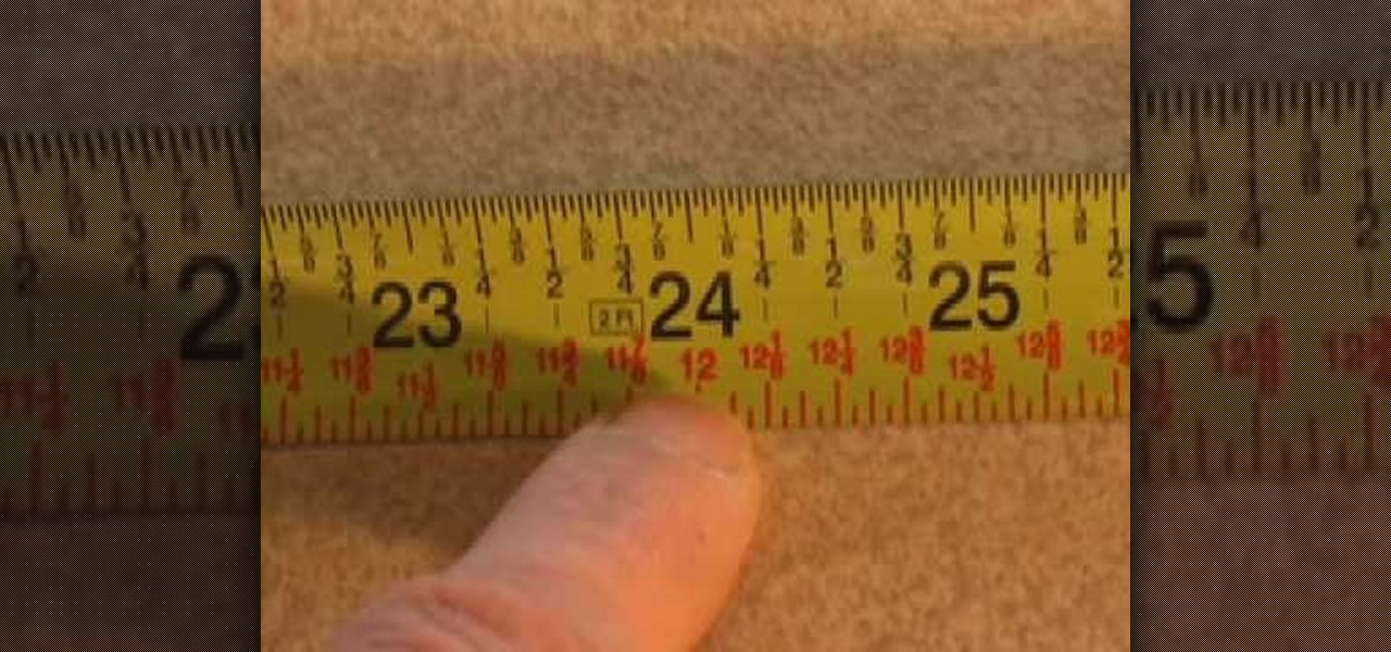
In this video we learn how to take accurate measurements in your home projects. First, you need to pick up the right tape measure for your project. Once you have picked out the right tape measure, you'll be able to use it for what you are trying to do. Now, learn how to read the numbers that are listed on the tape measure and find the precise measurement of your project. Make sure you take down all of the inches so you build everything correctly and don't have to go back and fix anything that...
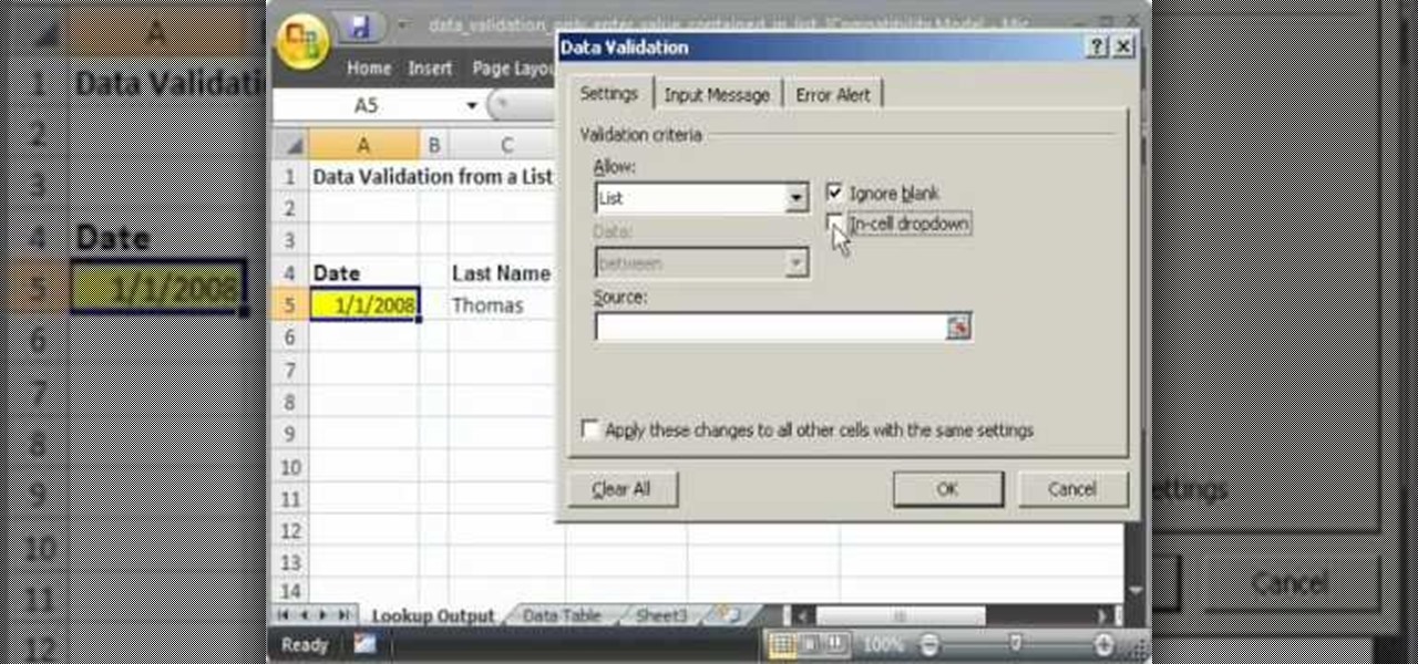
This video shows you how to idiot-proof a data set in Excel pretty much. It demonstrates how to enable data validation in a cell, so that when you type something in it must be in a predetermined list or will not work. Start by typing in your data table in a second tab. His example is a date, then information about certain employees based on that day. To enter the data validation menu, click the cell you want to use and then hit ALT+D+L to bring it up. Go to settings, then under the Allow menu...

Looking to find the standard deviation of your set of values? Standard deviation quantifies how diverse the values of your data set are, and is useful in determining how different your numbers are from each other.

In Halo: Reach for the Xbox 360, there is so much to do! The campaign, the multiplayer, the achievements! But One tough one to get is all 19 hidden data pads. Luckily for you, the first nine can be acquired on any difficulty, and in this video you will learn the locations of all nine of the initial data pads on levels such as Winter Contingency and Pillar of Autumn!
We all have our reasons for erasing personal data from a phone. Whether you just ended a bad relationship whose face you never want to see again (lots of text messages) or just want to restore your privacy on the cell phone, erasing may be your only option.
If you use Microsoft Excel on a regular basis, odds are you work with numbers. Put those numbers to work. Statistical analysis allows you to find patterns, trends and probabilities within your data. In this MS Excel tutorial from everyone's favorite Excel guru, YouTube's ExcelsFun, the 27th installment in his "Excel Statistics" series of free video lessons, you'll learn how to create a quantitative data dot plot chart using the REPT and COUNTIF functions.
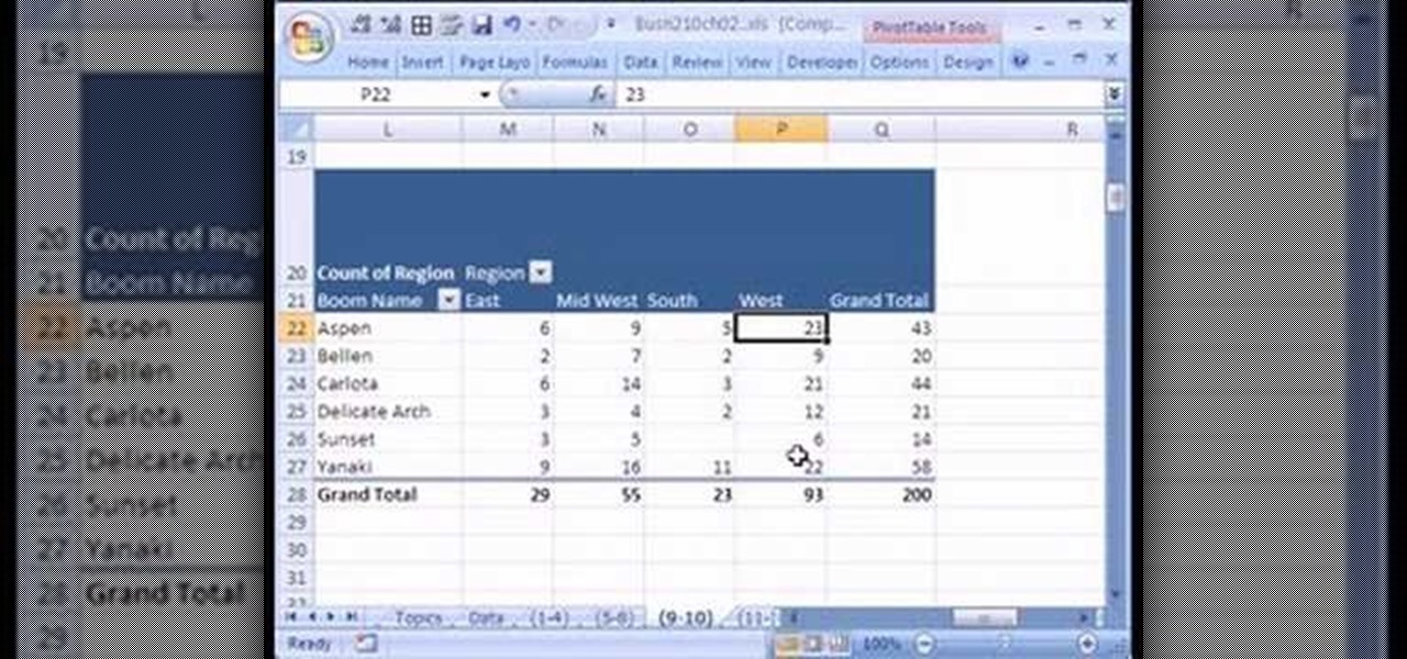
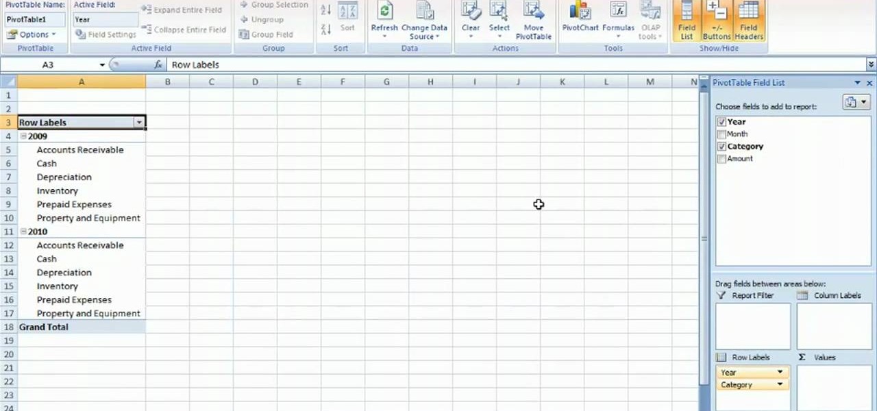
If you use Microsoft Excel on a regular basis, odds are you work with numbers. Put those numbers to work. Statistical analysis allows you to find patterns, trends and probabilities within your data. In this MS Excel tutorial from everyone's favorite Excel guru, YouTube's ExcelsFun, the 16th installment in his "Excel Statistics" series of free video lessons, you'll learn how to cross tabulate & do percentage cross tabulation for categorical data using a pivot table (PivotTable).
If you use Microsoft Excel on a regular basis, odds are you work with numbers. Put those numbers to work. Statistical analysis allows you to find patterns, trends and probabilities within your data. In this MS Excel tutorial from everyone's favorite Excel guru, YouTube's ExcelsFun, the 17th installment in his "Excel Statistics" series of free video lessons, you'll learn how to cross tabulate & do percentage cross tabulation for categorical data using formulas rather than pivot tables.
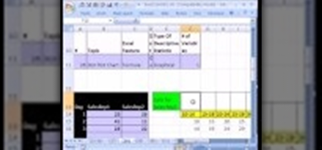
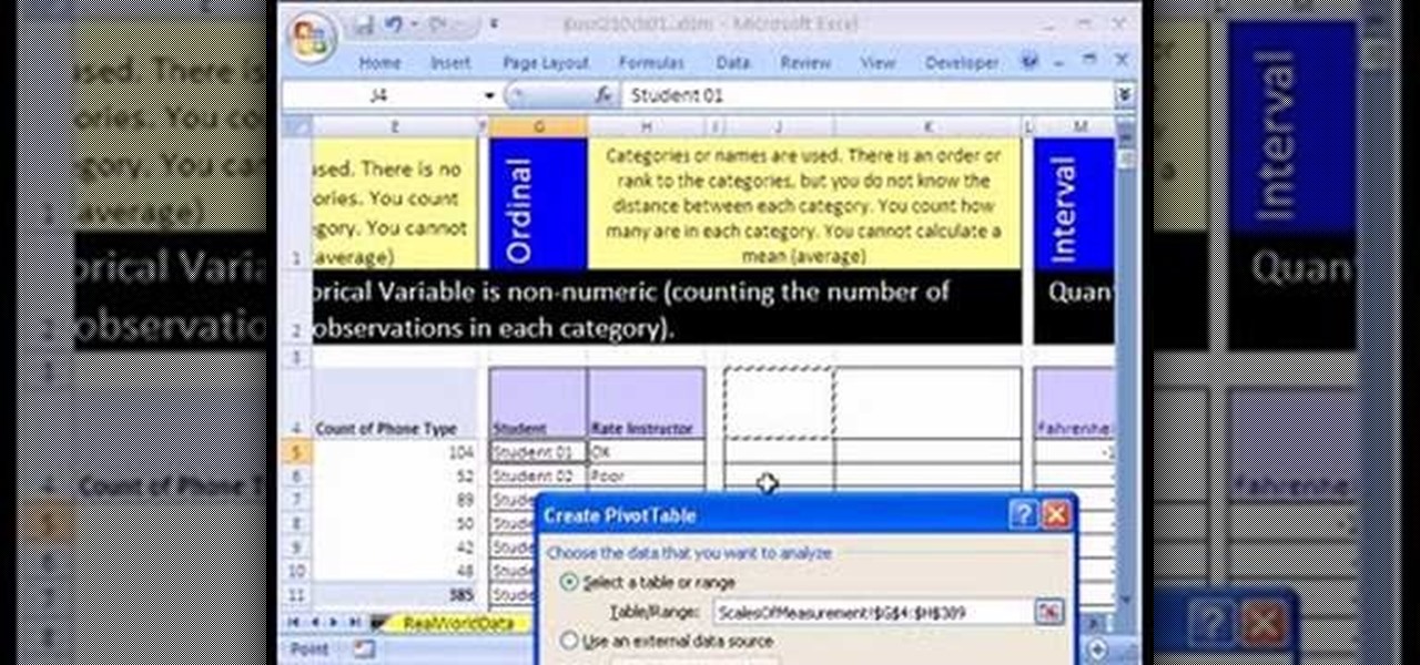
If you use Microsoft Excel on a regular basis, odds are you work with numbers. Put those numbers to work. Statistical analysis allows you to find patterns, trends and probabilities within your data. In this MS Excel tutorial from everyone's favorite Excel guru, YouTube's ExcelsFun, the 10th installment in his "Excel Statistics" series of free video lessons, you'll learn how about data sets and the nominal, ordinal, interval and ration scales/levels of measurement and see two Pivot Tables that...
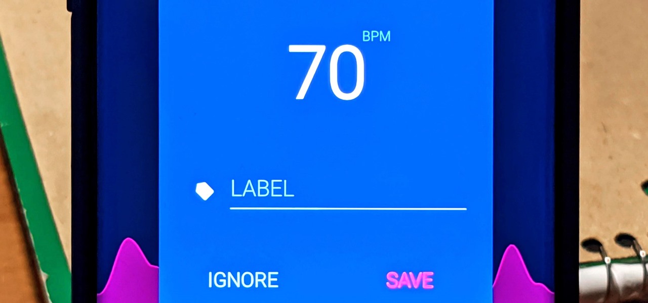
With the rise of smartwatches and wearables, you'd almost expect to need one to get a heart rate reading. While these devices can be helpful, not everyone has or wants to wear a gadget all the time to track their BPM. Luckily, when you combine Google Fit with a popular third-party heart rate measuring app, it will make things easy for you.
Excel is great, and if you're a Mac user, Excel 2008 for Mac has a lot of new and useful great features you can use to maximize efficiency in your spreadsheets. Excel doesn't have to be the boss anymore, you can! The Microsoft Office for Mac team shows you all the great features in this how-to video.
Data can be troubling, especially if there's a ton of it plaguing your Excel worksheet. But Excel 2008 for Mac makes life a little easier and less confusing thanks to a few worksheet tips and features you can utilize to work with your data in worksheet cells. The Microsoft Office for Mac team shows you just how to work with worksheets in this how-to video.
Not every client or coworker likes to mine through a spreadsheet to find all the important data. So, with Excel 2008 for Mac, you can easily share that data without sending the entire Excel spreadsheet. To do this, all you need to do is to use the "copy as picture" option. The Microsoft Office for Mac team shows you just how to insert a spreadsheet snippet in this how-to video.
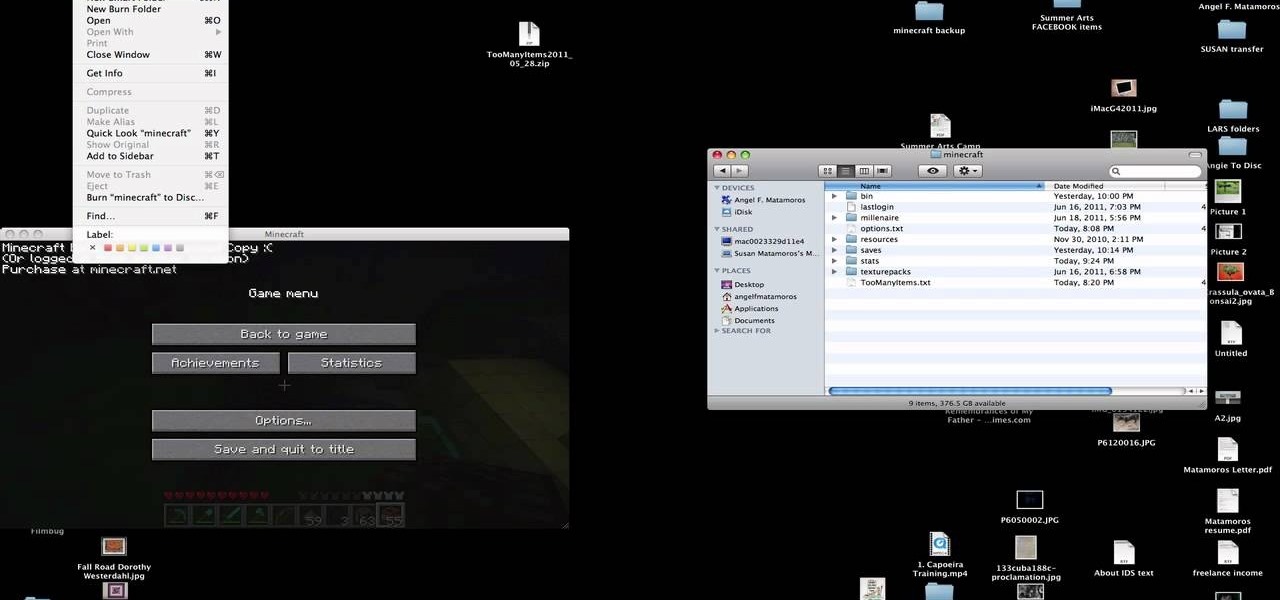
You have worked long and hard creating an entire world of Minecraft data. Make sure you have all of that saved data backed up. Watch this video to learn how to backup your Minecraft data. You will be glad that you did.
Thirty dollars a month may be a little steep for an unlimited data plan for iPad users. To cut down on your data usage, you can download the Offline Pages app to browse articles or blogs offline. InstaPaper is another account you can use as well, and both will cut down on your data usage per month.
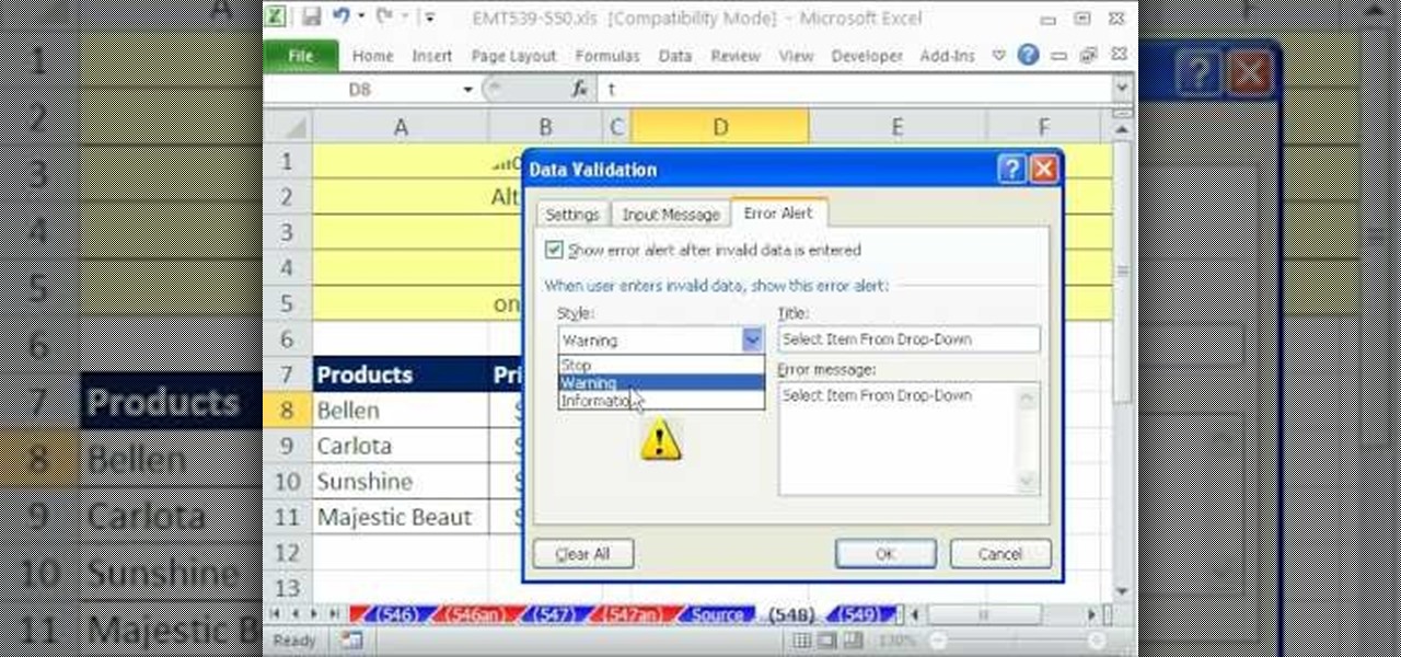
If you want to manage what sort of data is entered into your Excel spreadsheet, data validation will help you to accomplish just that. In this Excel tutorial from ExcelIsFun, the 549th installment in their series of Excel magic tricks, you'll learn how to use data validation to full effect in your Microsoft Office projects.
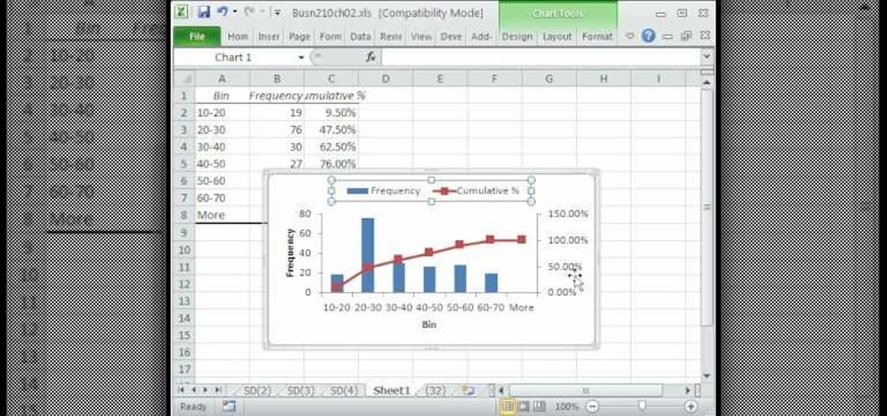
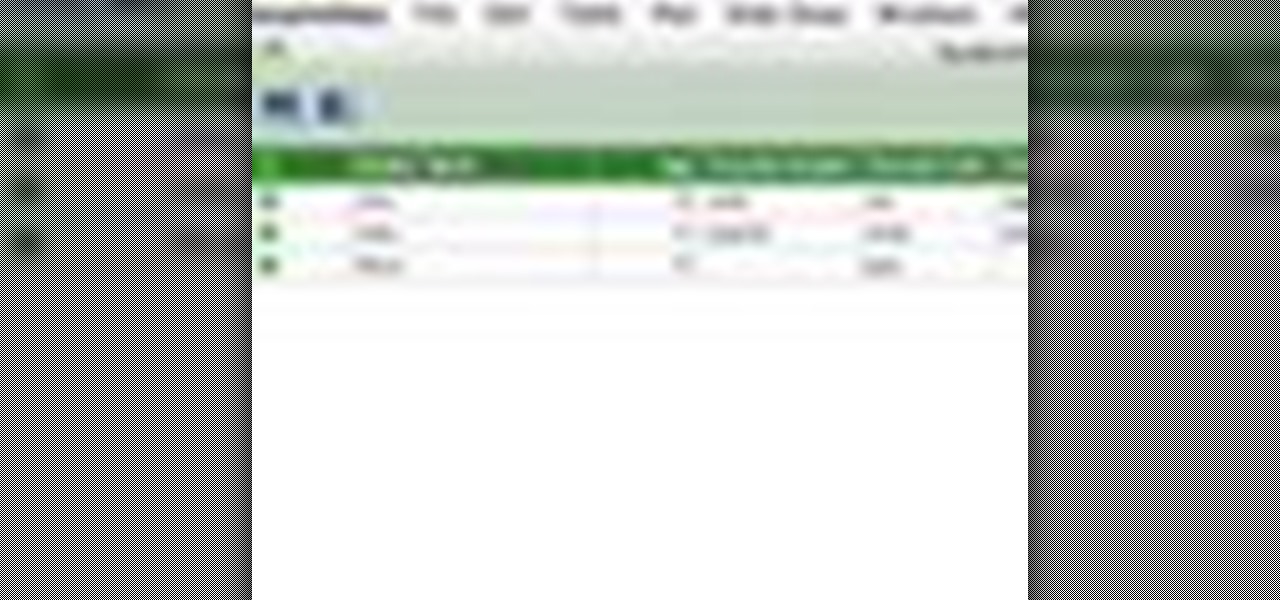
A histogram is a summary graph showing a count of data points that fall in various ranges. Histograms are used in statistics and other forms of mathematics. In this video, learn how to create your own histogram using data analysis on the computer. This tutorial will show you how to create a frequency distribution, a cumulative frequency distribution, a histogram chart and an ogive chart with the data analysis add-in.
See how simple it is to create data-driven web sites using ASP.NET 2.0, Visual Web Developer 2005 Express Edition, and SQL Server 2005 Express Edition. Watch this video tutorial to learn how to create a database, add its data, and display that data on a web page.
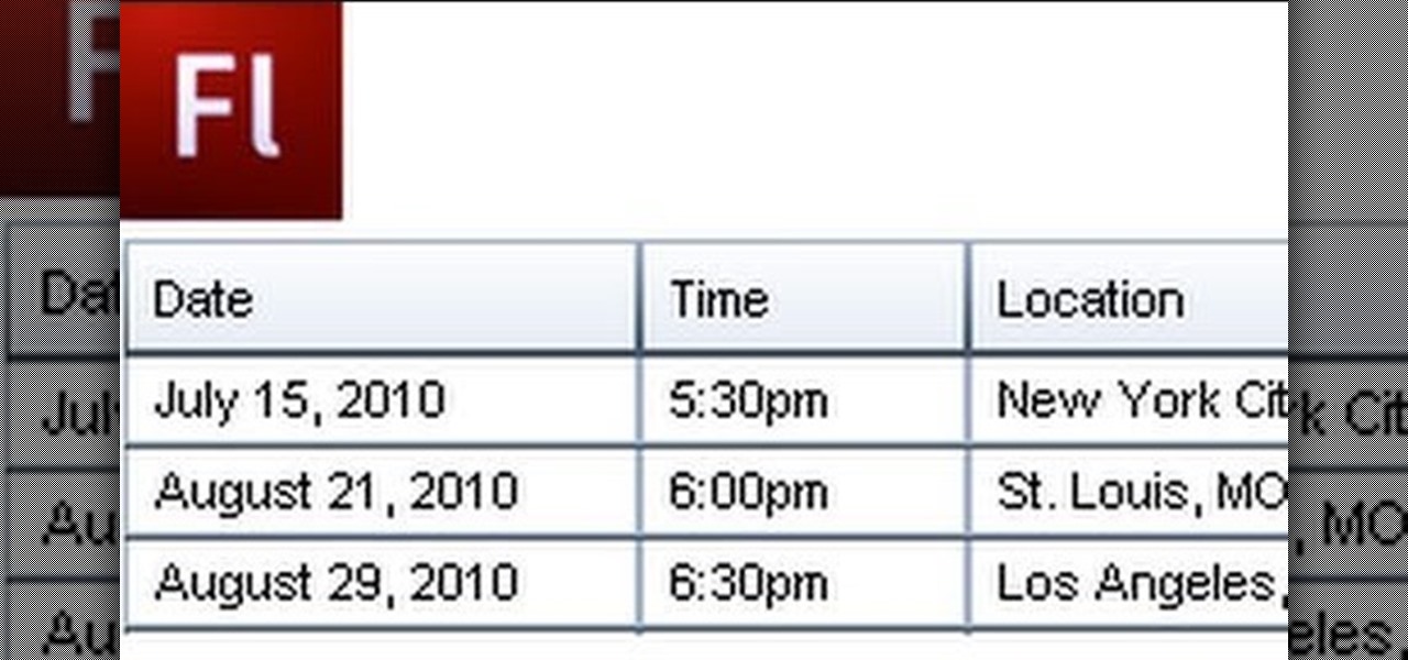
A Data Grid lets you organize information on your website or other Flash project. Create lists or schedules, like concert dates, by using the Data Grid component included in Adobe Flash CS4, and then modify it using Action Script 3.
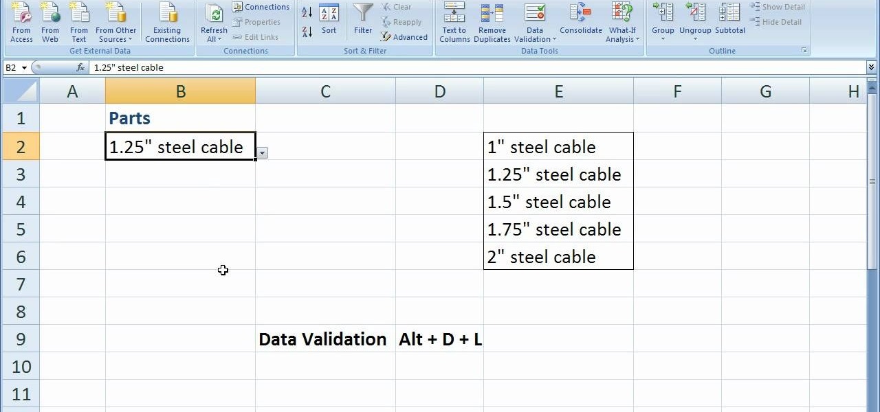
In this software video tutorial you will learn how to create drop down menus in Excel using Data Validation. This example will show you how to display a list of parts in a drop down menu. Create the list of parts somewhere in your worksheet. Then in the cell underneath the one where you want to display the parts, go to the data validation window and enter the data. For this select the cell and then press 'Alt + D + L' to bring up the data validation box. Here you click on 'settings' and selec...
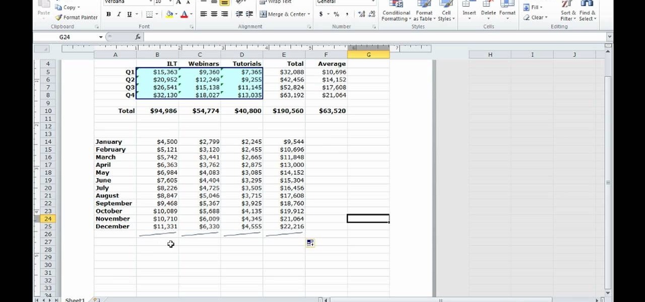
Learn how to create a summary of your budget data. Whether you're new to Microsoft's popular digital spreadsheet application or a seasoned business professional just looking to better acquaint yourself with the Excel 2010 workflow, you're sure to be well served by this video tutorial. For more information, and to get started summarizing your own budget data, watch this free video guide.
Quickly and intelligently organize your information through use of ColdFusion 9's ever-useful data grid feature. Whether you're new to Adobe's popular rapid Internet application development platform or simply wish to become better acquainted with the program, you're sure to find benefit in this free video software tutorial. For more information, including specific, step-by-step instructions, take a look.
Want to know how to back up your data to an external hard drive? Protect yourself against data loss and heartbreak with this free home computing how-to from the folks at CNET TV, which offers complete instructions on how to back up your important files either manually or automatically. For specifics, and to get started backing up your own stuff, watch this handy how-to.
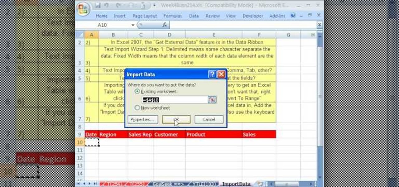
Whether you're interested in learning Microsoft Excel from the bottom up or just looking to pick up a few tips and tricks, you're in the right place. In this tutorial from everyone's favorite digital spreadsheet guru, ExcelIsFun, the 23rd installment in his "Highline Excel Class" series of free video Excel lessons, you'll learn how to import data into Excel from text files, web sites, Excel files and Microsoft Office Access files. Also see how to import currency rates and major indicies from ...
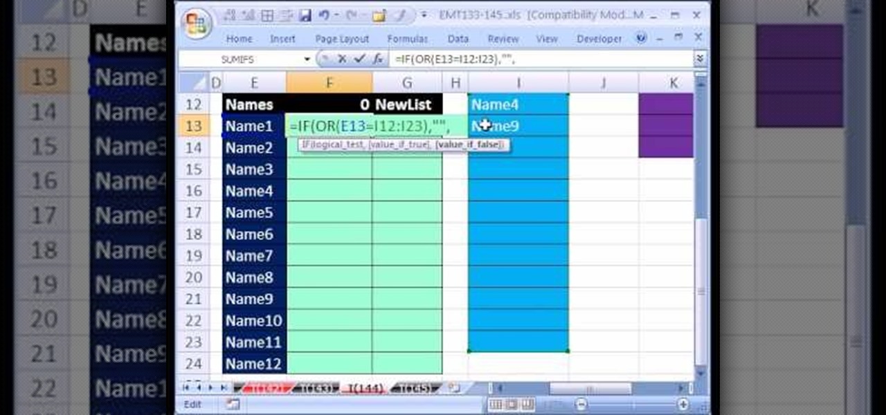
Love Microsoft Excel? This clip contains a tip that just might induce you to. With this free video tutorial from ExcelIsFun, the 144th installment of his "YouTubers Love Excel" or YTLE series of free video MS Excel lessons, you'll learn how to work around data validation's one-rule limit by creating a second shrinking list that looses values as they are used in the data validation area.
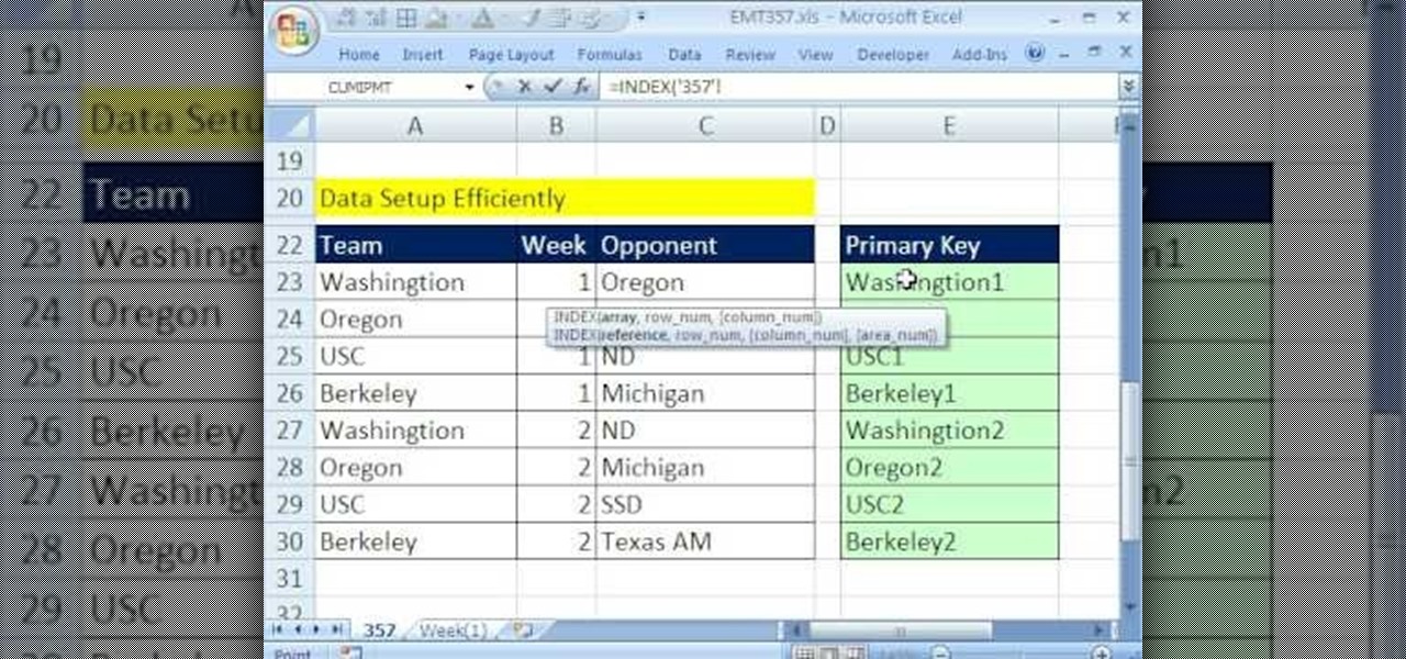
New to Microsoft Excel? Looking for a tip? How about a tip so mind-blowingly useful as to qualify as a magic trick? You're in luck. In this MS Excel tutorial from ExcelIsFun, the 357th installment in their series of digital spreadsheet magic tricks, you'll learn how to pull data from individual sheets to a single master sheet given improper data setup.
This lynda.com video tutorial shows how to use container fields with FileMaker Pro 10. When you want to create fields in FileMaker database you have the choice on what kind of fields you want to make. Many general fields are self explanatory like text, date etc., but there is a special kind of field called the container field. FileMaker Pro container field is a versatile data type in that it can store any kind of binary data. Container fields can be used to hold binary data in four broad clas...
This tutorial on the companion Tech Ease for Mac site shows you how to use Inspiredata to collect, organize, and visualize data using several types of diagrams supported by the program. The movies were recorded on a Mac, but Inspiredata is a cross-platform program so the steps shown should work on the Windows version of the program as well. Inspiredata works like a database system that allows you to add notes and more.
Your data is your most important asset on your computer. Learn how to keep your data safe using Carbonite.com
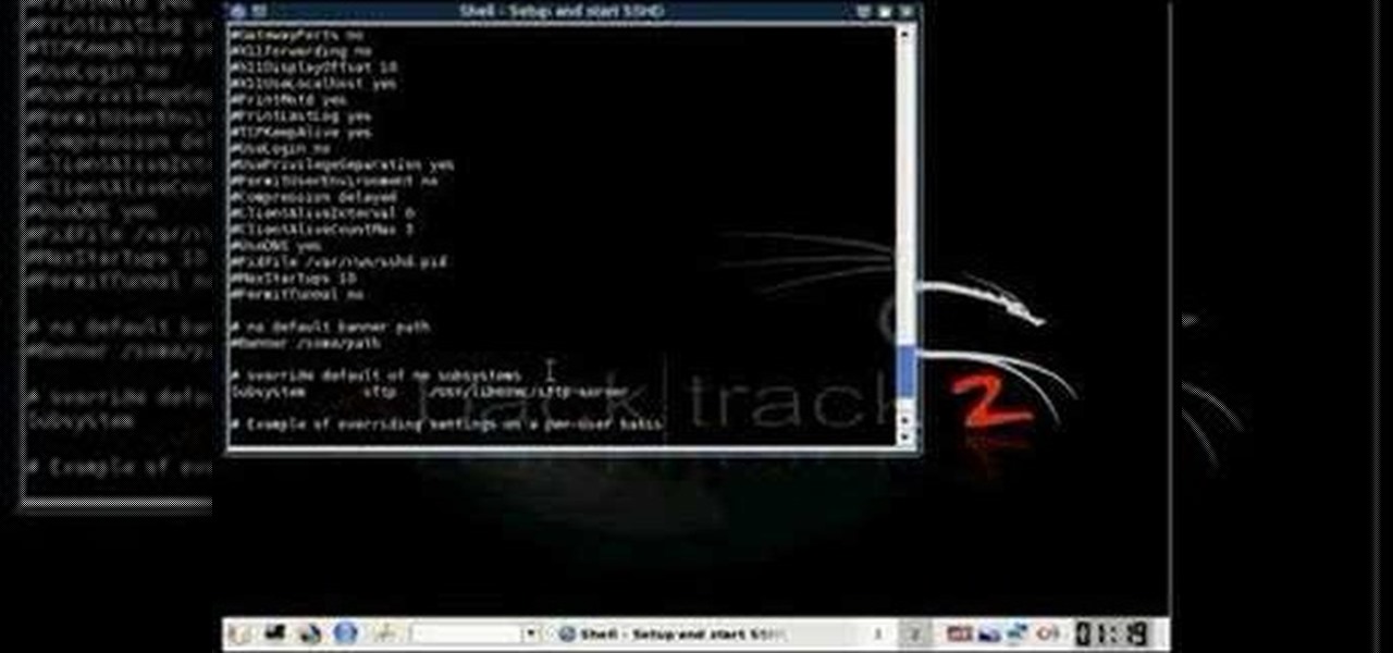
This new episode of Full Disclosure shows you how to use a SSH Tunnel to secure your data when you are on an untrusted LAN (ex. Coffee Shop, School's network, or Defcon). Furthermore, you can use the SSH Tunnel to bypass the LAN's internet filters. The SSH tunnel protocol works by encapsulates your data into an encrypted payload and transmitting it to the SSH Server which is setup on a trusted LAN.
QR codes allow you to quickly and easily store and retrieve data within a single image. Much like barcodes at grocery stores, QR codes are images that can be scanned to discover data, such as an online website URL. Additionally, they can also be created by inputting text data into a QR code generator. Try scanning some of the QR codes in this video with an app on your phone or tablet to see how they work!
Cylinder heads are tough pieces of metal, and determining whether one is bad if it isn't snapped in half isn't as easy as it sounds. Watch this video to learn a fast and accurate way of assessing whether a cylinder head is bad.
Okay, so a raven isn't the most auspicious thing to origami, but this delicate origami raven would be a wonderful and spooky craft to make for Halloween. You can place it on top of pumpkins or looking down jeeringly from windowsills.
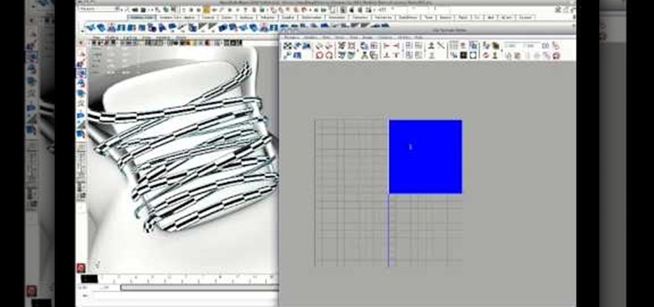
Creating good UVs with Maya can be tough, and get tougher depending on what type of object you are trying to unwrap. This short video tutorial covers how to create accurate UVs for long objects like rope or, in this case, shoelaces. This is a simple technique, but one that should enable you to model much more smoothly and accurately in the future, especially if you often find yourself creating 3D models of shoes.
There is a new function in MS Excel 2010 called ‘Sparkline’ which helps you quickly find trends associated with a set of data. To create Sparkline, you can go to ‘Insert’ tab and then select ‘Sparkline’ section and then select the graph type. After you enter the data range and location range, the Sparkline will show up indicating the trend based on the data range you identified earlier. You can change the types and styles of your Sparkline easily. As the video demonstrates, whenever you use E...
Check out this DIY video tutorial from Curbly, the best place to share pictures of your home, find design ideas, and get expert home-improvement advice.
When you add accurate information about each song, it'll be much easier to browse and find songs in your library. Choose a song, go to the file menu, and click "Get info." You can even add comments of your own to a song's information. These are great tools you can use to organize your music.